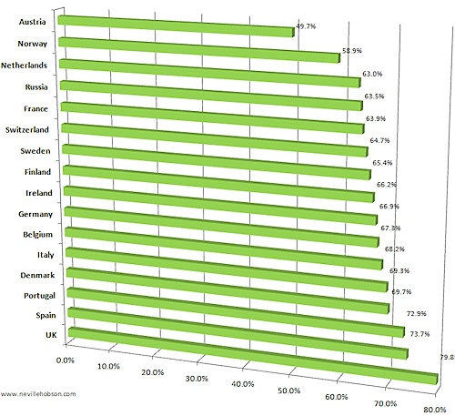
European social network usage
Earlier in the week, comScore released their latest figures on European social network usage, which Neville then kindly graphed in Excel for us all:

A pretty astounding chart that shows social media’s impact isn’t limited just to the US and the UK. comScore also released data for the Asia Pacific region on the same day – anyone fancy combining the 2 sets of data into one chart?
Update: Matt Wardman has created a single chart…