More than two in three people on Earth are now online. Here, Kepios founder Simon Kemp takes us through the updates in our latest Digital 2024 report.
It’s only been a few weeks since we published our flagship Digital 2024 Global Overview Report, but even in that short space of time, the world’s digital behaviours have continued to evolve.
The first three months of 2024 have seen a number of big digital milestones, and our huge new Digital 2024 April Global Statshot Report – published in partnership between We Are Social and Meltwater – reveals a wealth of impressive headlines and trends.
Top stories this quarter include:
More than two-thirds of the world’s population now uses the internet
The overall time that the world spends consuming media has declined
There’s a lot of confusion about what “Gen Z” is really doing online
We may be starting to see a change in the world’s online priorities
Social media user growth continues, despite media misrepresentation
Connected experiences are moving to smaller screens
Video games are on the ascendant, gaining in popularity across all ages
Why marketers might want to take a fresh look at Yahoo!
That’s only a teaser of what that you’ll find in this quarter’s full report though, and this latest edition of our Global Digital Reports series is packed with loads more data, insights, and surprises.
We’ve also added a number of new charts and datasets this quarter, so it’s well worth exploring the full report to see what’s new.
The ultimate collection of digital data
Weighing in at 450 pages, this is by far our richest Global Digital Statshot Report yet, and that’s all thanks to the support and generosity of our wonderful data partners:
All of this analysis was written by a human, without the use of generative AI. We may use AI to help structure data and identify patterns, but we still rely entirely on human expertise to make sense of trends and implications.
⚠️ Important notes
Please note the following before you dive into this latest round of data:
GWI has revised the “Types of Websites and Apps Used” in its Core survey, which has had an impact on various values throughout our reports, including behaviours such as the use of search engines and banking apps. As part of the same update, GWI has also revised figures for this question for previous periods. As a result, change data contained in this quarter’s report will reflect “like-for-like” change, but note that values in associated timeline charts may not match those we published in previous reports.
Top Takeaways
Looking for a guided tour of this quarter’s top stories? This video unpacks 10 essential takeaways from this quarter’s report in just 10 minutes:
The complete Digital 2024 April Global Statshot Report
You’ll find this quarter’s complete report in the embed below (click here if that’s not working for you), but read on past that to explore my in-depth analysis of what all these numbers actually mean for you and your work.
The global state of digital in April 2024
Let’s begin with the latest headlines for digital adoption and use around the world [tip: feel free to copy-paste this section to create an easy social media post – just remember to tag us!]:
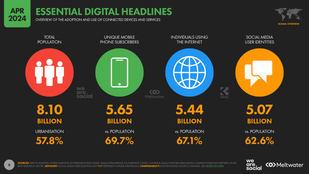
Data from the United Nations World Population Prospects shows that there are now 8.10 billion people living on Earth. The global population has increased by 74 million over the past year, resulting in annual population growth of 0.9 percent.
The number of unique mobile phone users sits at 5.65 billion, which means that 69.7 percent of the world’s total population now uses some kind of mobile handset. Unique mobile users grew by 2.4 percent over the past 12 months, thanks to an additional 133 million new users.
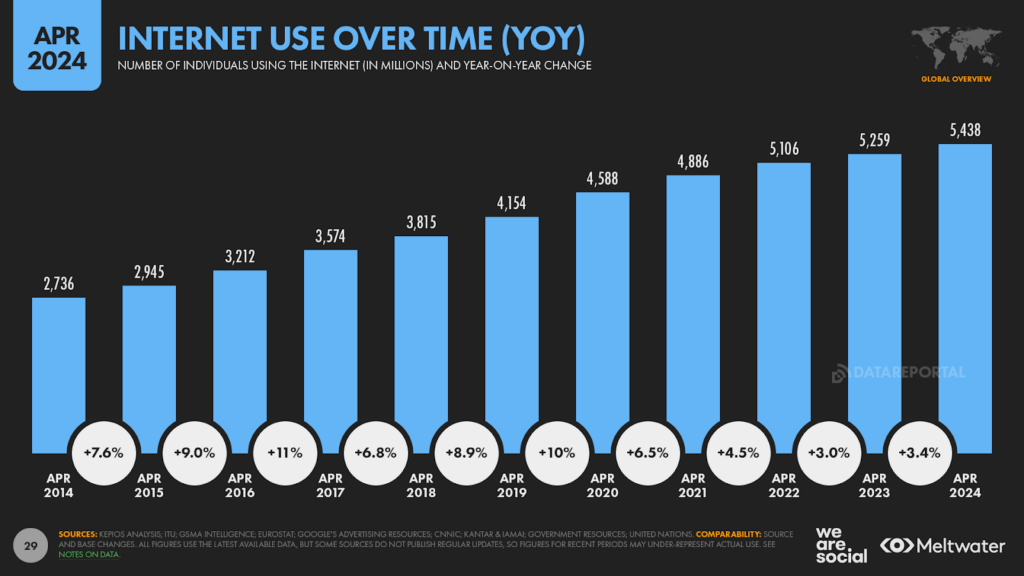
Internet users have climbed to 5.44 billion, with 178 million new users over the past year taking the global internet penetration rate to 67.1 percent. As we’ll explore in more detail below, this means that more than 2 in 3 people on Earth are now online. Internet user numbers continue to grow too, with the latest figures pointing to a year-on-year increase of 3.4 percent.
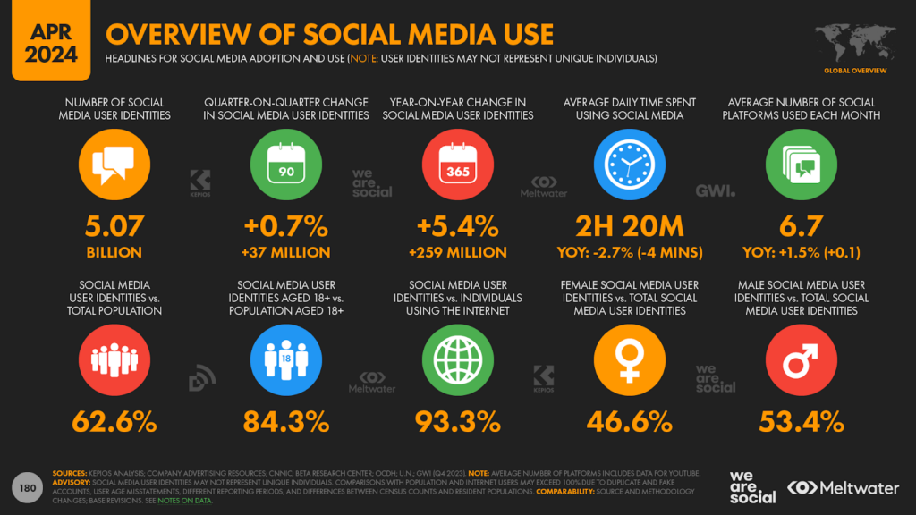
Kepios analysis shows that active social media use continues to grow as well, with platforms adding more than a quarter of a billion new unique user identities since this time last year. The global user total reached 5.07 billion by the start of April 2024, with this figure 5.4 percent higher than the total we saw in April 2023.
But beyond impressive headlines and tasty trivia, what do this quarter’s numbers tell us about how people’s digital behaviours are changing and evolving?
Let’s get nerdy, and go deeper into the numbers…
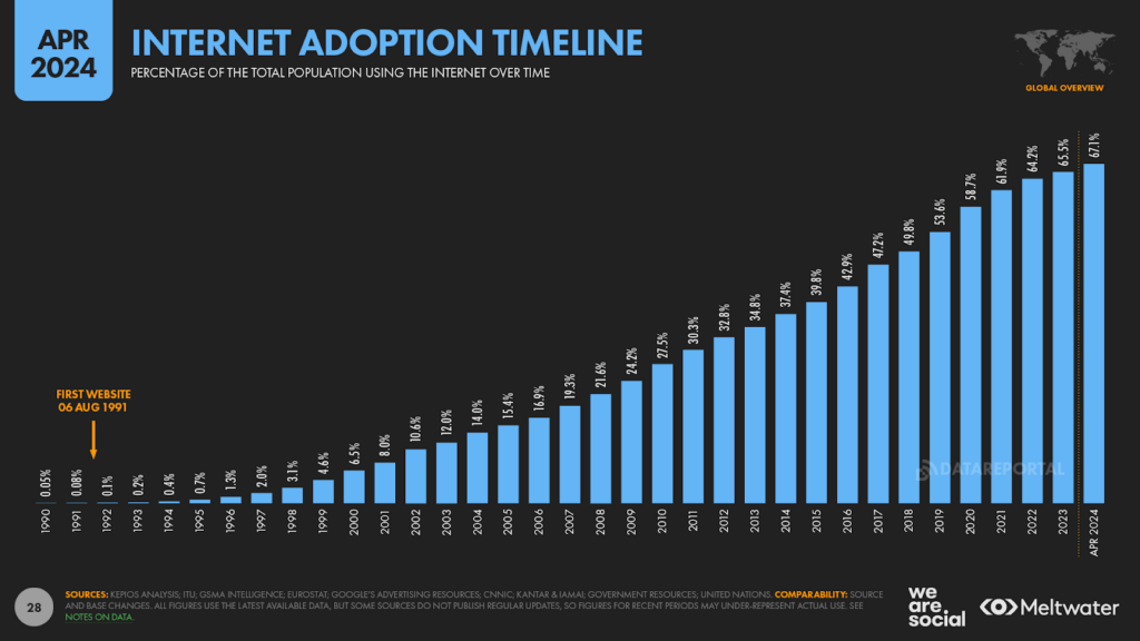
Two-thirds of the world is now online
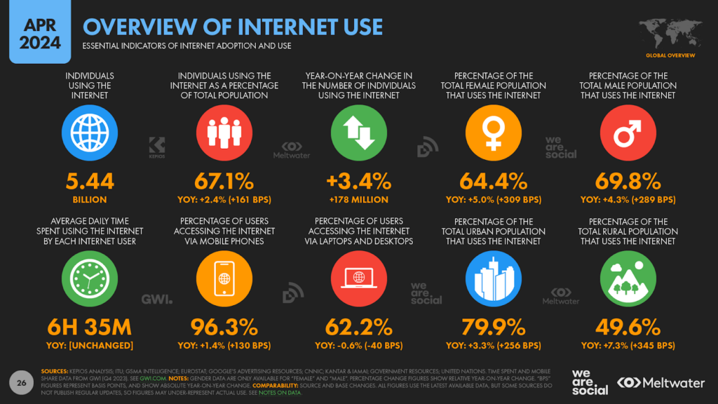
Kepios’s analysis of the latest data shows that internet users have reached “supermajority” status, with more than two in three people on Earth now online.
Data from a variety of reputable sources including the ITU, GSMA Intelligence, and Eurostat indicate that the number of people using connected technologies reached 5.44 billion at the start of April 2024, which equates to 67.1 percent of the world’s total population.
That global user total has increased by 178 million since this time last year, delivering annual growth of 3.4 percent.
If we take the advent of the web as the start of the internet as we know it today, it’s taken just under 33 years for internet users to reach this important milestone.
For perspective, barely 1 in every 1,000 people on Earth used connected tech when Tim Berners-Lee published the first website on 06 August 1991, when the erstwhile internet user base sat somewhere between 5 and 6 million.
User figures have mushroomed by a factor of almost 1,000 since then though, and at current growth rates, it would only take about 12 days for the world to add the equivalent of every one of those pre-web internet users.
Ever more connected
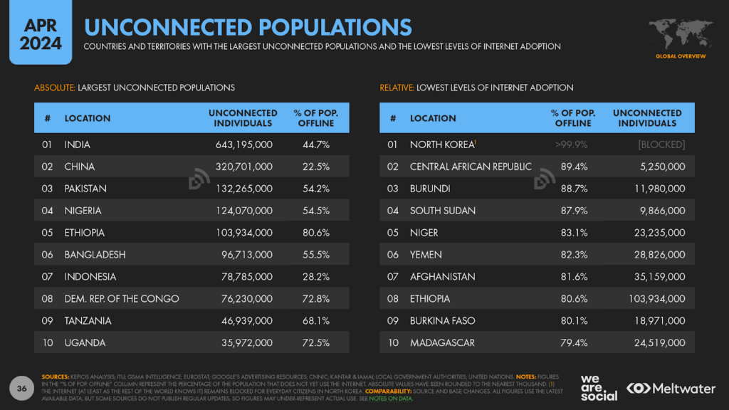
India accounted for more than a third of the global increase in internet users over the past 12 months, with research published by Kantar and IAMAI pointing to an increase of more than 60 million new users since early 2023.
India’s internet population has grown by more than 7 percent over the past year, accelerating a trend that we explored in some detail in a recent deep-dive article.
Meanwhile, China added 27 million new internet users over the past year, Pakistan 24 million, and Indonesia a further 16 million.
In relative terms, Pakistan saw the fastest growth in internet users over the past 12 months, with the country’s connected population increasing by 27 percent year on year.
However, the country’s internet penetration rate still lags the global average, and despite these recent gains, less than half of Pakistan’s population is online today.
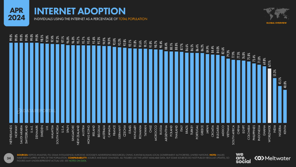
At the other end of the spectrum, 11 countries now report internet adoption rates in excess of 99 percent, while a total of 63 countries report internet adoption levels beyond 90 percent.
If you’d like to know more about internet connectivity at a local country level, our Digital 2024 reports are an excellent place to start – click here to learn more.
Billions still offline
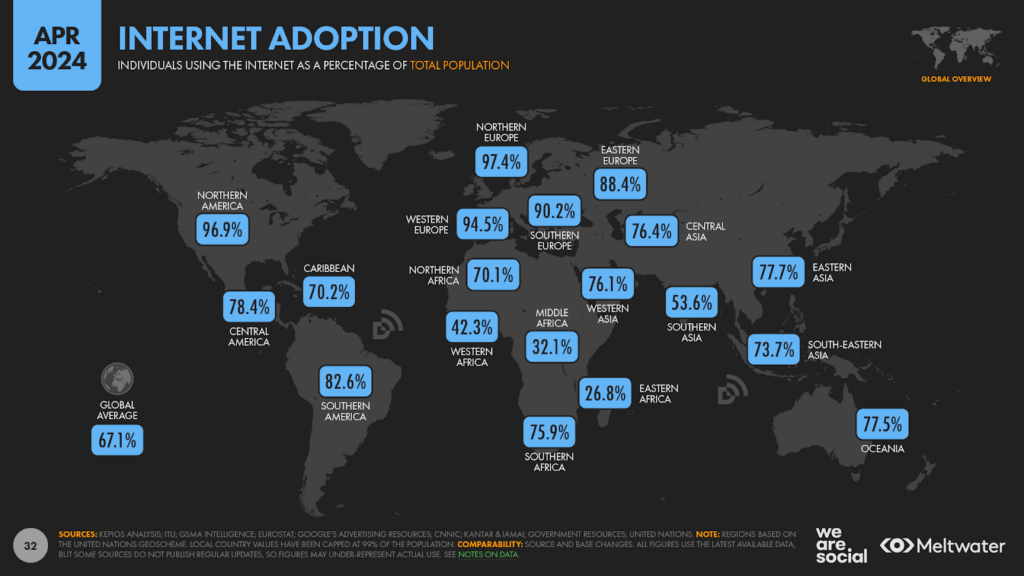
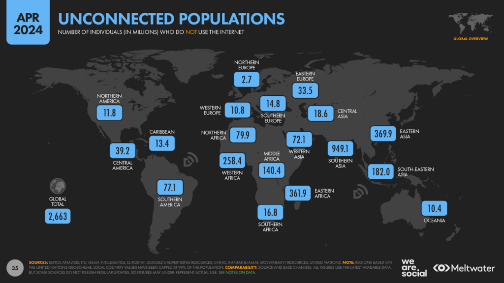
But despite today’s impressive figures, we’re still a long way from reaching the United Nations’ stated goal of “universal connectivity”, and Kepios’s analysis indicates that more than 2.66 billion people remain offline in April 2024.
In better news, we’ve seen promising gains in internet adoption across some of the least connected countries over recent months, with both Mozambique and Uganda registering double-digital annual gains.
However, internet adoption still languishes below 25 percent in a total of 12 countries, and the internet – at least as the rest of the world knows it – remains entirely blocked for everyday citizens in North Korea.
As part of our Digital 2024 “Deep Dives” in January, we published a comprehensive study of the various barriers to improving internet access, explorings topics such as:
Politics and war
Device and data affordability
Literacy and digital skills
Infrastructural challenges
Misogyny
If you’d like to learn more about these issues, I’d strongly urge you to read my complete analysis, together with some recommendations for further reading that you’ll find at the bottom of that linked article.
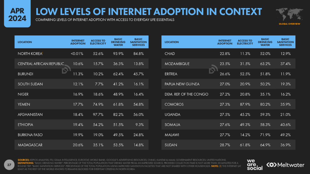
However, it’s worth highlighting here that low levels of internet use often coincide with more fundamental challenges, such as limited access to electricity and everyday life essentials such as drinking water and basic sanitation.
For related reasons, levels of internet use are still considerably lower in rural areas than they are in urban centres.
Indeed, Kepios analysis suggests that roughly 4 in 5 people living in towns and cities now use the internet, but – at a worldwide level – less than half of the people living in rural areas are online today.
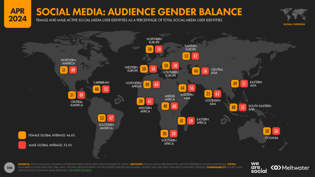
Meanwhile, a stubborn digital gender divide also persists in many parts of the world, and – at a worldwide level – internet adoption amongst men is still 5.4 percentage points higher than it is for women (69.8 percent vs. 64.4 percent, respectively).
However, local divides are often considerably wider than these global figures suggest, especially across the Global South.
For example, our analysis of the latest social media data indicates that nearly twice as many men as women may use the internet across Southern Asia today.
Global internet audience catching TV
With more than two-thirds of the world now online, it’s worth comparing the use of connected tech with that other great medium of our age: television.
Data from Statista indicates that “conventional” television – i.e. TV content that isn’t delivered via the internet – currently enjoys a global penetration rate of 68.1 percent, which equates to roughly 5.52 billion global TV viewers.
Comparing this penetration rate with the latest figures from GSMA Intelligence reveals that there are already more mobile users than there are TV viewers around the world, which suggests that mobile phones are now the most used devices on the planet.
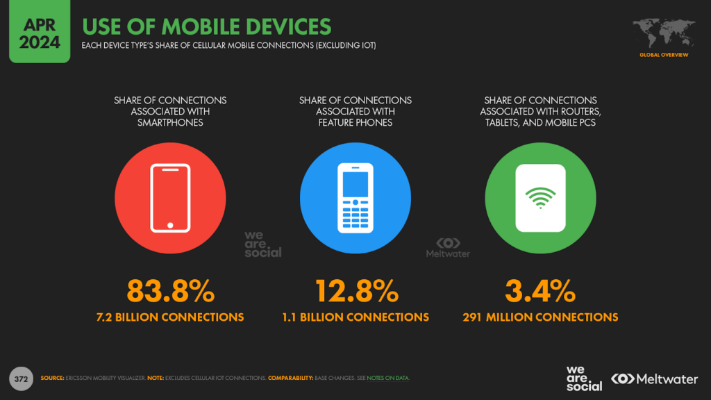
However, data from Ericsson suggests that 1.1 billion of the 8.3 billion mobile handsets in use today are still “feature” phones (12.8 percent), which helps to explain why internet use still lags the global TV penetration rate by one percentage point.
However, the reach of “conventional” TV is only increasing by fractions of a percentage point each year, while internet penetration has grown by 3.4 percent over the past 12 months.
And as a result, if internet users continue to grow at their current rate, we should see internet penetration surpass that of broadcast TV sometime in the first half of next year.
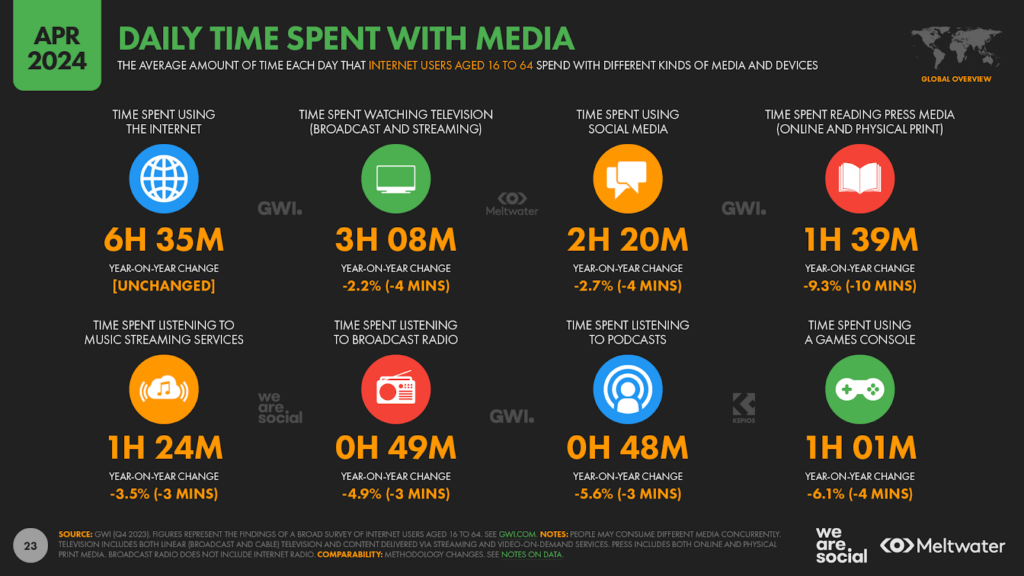
Media consumption declines
The latest wave of research from GWI suggests that the world spent less time consuming media in the final three months of 2023 than it did during the same period the year before.
Particularly worthy of note is the fact that the amount of time people spend watching TV has fallen by a further 4 minutes per day over the past year, extending the declines that I detailed in my January analysis.
However, GWI’s research identified a decline across almost all mass media over the past 12 months, with internet use the only media activity to escape an annual drop.
It’s worth highlighting that a meaningful proportion of people’s daily media consumption happens concurrently.
For example, a teenager might listen to Spotify and chat with other gamers on Discord at the same time as they play a video game, while older generations might listen to the radio at the same time as reading a newspaper.
It’s also important to remember that some of these activities are a subset of others, such as social media time being a part of our overall internet time.
As a result, we can’t simply sum the time for each of these individual media activities together in order to identify our overall “daily media diet”.
However, with none of these activities seeing an increase in daily time over the past year, it’s safe to conclude that our overall media activity has declined by roughly 2 to 3 percent over the past year.
That may not sound like a lot, but added up across these activities, it results in 30 fewer minutes spent with media each day, which has important consequences for media brands and advertisers alike.
Internet time back to recent lows
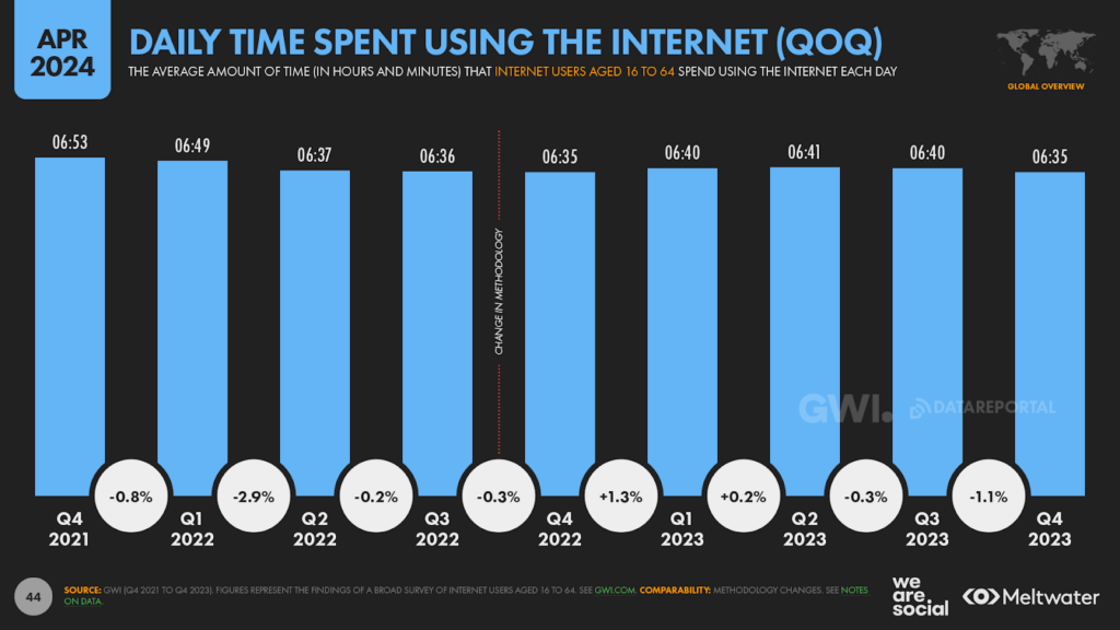
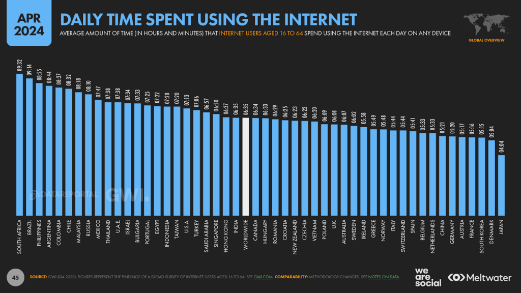
Meanwhile, the average time that the world spends using the internet each day has returned to the same level that we saw 12 months ago, erasing the gains that we reported in January.
The current average of 6 hours and 35 minutes is the same as the figure we reported this time last year, but – despite remaining unchanged on an annualised basis – this global average actually fell by more than 1 percent over the past three months.
And while a drop of 4½ minutes per day doesn’t sound like much, that adds up to almost 7 hours less per person – or one full day’s worth of connected activity – over the past three months.
However, it’s important to consider this decline in the context of the broader decline in media activity that we explored above, especially considering the fact that internet activity held stable on a year-on-year basis.
The dramatic impact of Covid-19 on the world’s media behaviours over the past 4 years makes it tricky to identify “seasonality” in recent data, so it’s unclear whether this quarter’s decline in internet time is part of a normal “cycle” of behaviour, or whether it signals a continuation of the declines that we examined in our Digital 2023 reports.
For perspective though, it’s interesting to note that countries at the top end of the rankings actually saw average daily internet use increase over the final three months of 2023, compared with the period from July to September 2023.
As a result, we’ll continue to keep a close eye on this valuable GWI data point, and keep you updated on any changes in our upcoming Global Digital Reports.
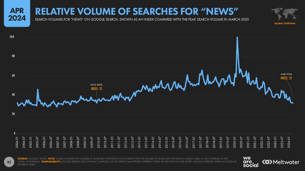
The decline of news
Returning to broader media declines, online and physical press media saw the biggest drops in daily time in GWI’s most recent survey, with the global average down by 10 minutes year on year.
And while not all “press” media could be considered “news”, this trend echoes the findings of studies such as the annual Digital News Report conducted by the Reuters Institute for the Study of Journalism (RISJ).
We’re hoping that the RISJ will publish its annual update to this series in time for our July 2024 Statshot Report, but the organisation’s 2023 data reveals that the world’s relationship with news is on a clear downward trajectory:
“…online consumers are accessing news less frequently than in the past, and are also becoming less interested. Despite the political and economic threats facing many people, fewer than half (48 percent) of our aggregate sample now say they are very or extremely interested in news, down from 63 percent in 2017.”
But this declining interest in news isn’t just evident in survey data.
For the first time since we started including Google Trends data in our Global Digital Reports, “news” has fallen out of the world’s 10 most searched terms.
It’s important to highlight that Google Trends data is “dynamically sampled”, which means that reported values for the same period can vary depending on when the tool is accessed.
In other words, the service may return different rankings and indices for what seems to be an identical query if that query is entered on different days, and as a result, this specific finding may be “exaggerated” by the particular sample that we received.
However, the overall trend is one of a clear decline since the relative highs in news interest that we saw 4 years ago, at the start of the Covid-19 pandemic.
However, the latest figures aren’t just down from their recent Covid-inspired highs, and the last time we saw the “news” index at its current level was 15 years ago – way back in November 2009.
The surprising truth about Gen Z’s digital behaviours
If you’ve spent any time reading the mainstream media over recent months, you’d be forgiven for concluding that Gen Z is using a completely different internet to everyone else.
For example, numerous journalists – and even some reputable researchers – have become obsessed with the idea that young people:
have completely abandoned Google for TikTok;
never use email;
never visit websites; and
don’t use the internet to socialise.
However, while these claims make for irresistible click-bait… they’re all incorrect.
Here’s what reputable data tells us about what Gen Z are really doing online.
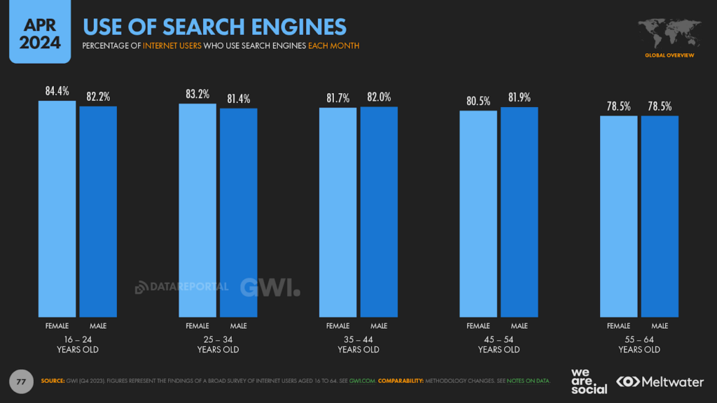
Gen Z are the biggest users of search engines
Yep, you read that correctly – young people still use Google.
Admittedly, internet users between the ages of 16 and 24 have embraced a wide range of new search behaviours – most notably social search – but that doesn’t mean they’ve given up on search engines.
In fact, GWI’s latest research shows that more than 83 percent of global internet users in this cohort have used a search engine in the past month, which is higher than the figure for any other age group in GWI’s survey.
And what’s more, the biggest users of TikTok – younger women – are actually the most prolific users of search engines.
Indeed, at a worldwide level, almost 6 in 7 female internet users aged 16 to 64 (84.4 percent) say that they’ve used a search engine in the past month, which is considerably more than the 64.1 percent who say that they’ve used either TikTok or Douyin in the past month.
So, don’t be fooled: Gen Z are comfortable using a variety of tools to find what they want, and just because they use one type of search doesn’t mean that they’ve “abandoned” any other.
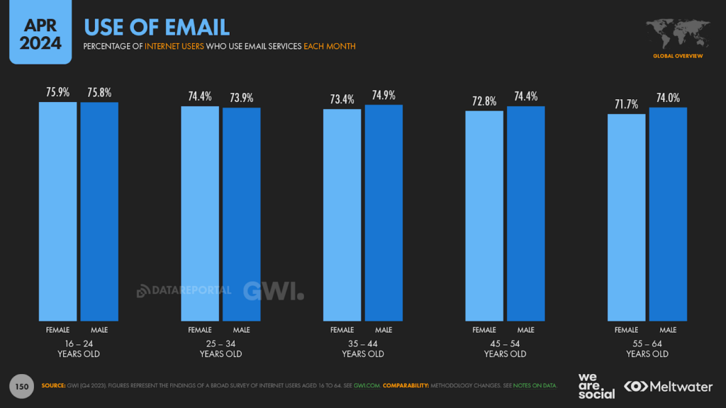
Gen Z are the biggest users of email
Did you do a double-take on that headline?
Don’t worry; I had to double-check the stats too.
But here’s the startling truth: at a worldwide level, internet users ages 16 to 24 are more likely to use email than internet users in any other age group in GWI’s survey.
Having said that, email use appears to be remarkably consistent across age groups, and roughly three-quarters of users across GWI’s working age survey cohort say that they’ve used an email service in the past month.
Now admittedly, these stats don’t tell us how often people use email within a given month, nor do they hint at what people in different age groups use it for.
However, the findings still hold true: young people still use email, regardless of what the mainstream media would have you believe.
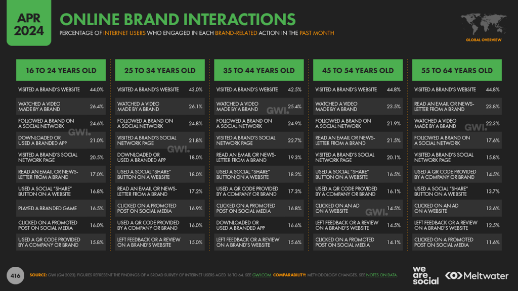
Gen Z still visit brand websites
This is another shocking revelation, but the data is unequivocal here too.
In fact, people aged 16 to 24 are actually more than twice as likely to have visited a brand’s website in the past month than they are to have visited a brand’s social networking page.
Now, admittedly, most young people probably wait for brands to appear in their social feeds rather than actively visiting brands’ social profiles, but the data also shows that young people are more likely to visit a brand’s website than they are to watch a brand video.
And what’s more, the proportion of young people who say that they visit brand websites (44.0 percent) is less than one percentage point lower than the number of Gen Xers who say the same (44.8 percent).
So, if you thought websites were irrelevant for younger audiences, think again.
However, whether your website is relevant to younger people is an entirely different question, and that’s down to whether or not you’re providing younger visitors with value.
Gen Z are the most likely to socialise via digital channels
While it’s certainly true that younger demographics don’t use “social media” in the same way that Millennials and Gen X do, the contention that Gen Z are not engaging with their peers online is simply incorrect.
In fact, young people are the most likely to say that they use the internet to stay in touch with friends and family, and – crucially – this is also their primary motivation for using the internet [more on that later].
And in another surprise for those who rely on media headlines to inform their understanding of Gen Z’s online behaviours, young people around the world are also more likely to use social networks than people in any other age group.
Similarly, they’re also more likely to use chat apps and messengers than any other age group, even though these services rank second amongst this younger cohort when it comes to the kinds of websites and apps they use.
Having said that, these motivations and behaviours don’t necessarily mean that young people are building meaningful relationships via online platforms, and there’s plenty of evidence to justify associated concerns about the impact of excessive screen time on young people’s mental health.
However, the important thing to consider here is that the findings in GWI’s survey point towards young people’s digitalintent.
Motivations explain why people do things – not whether or not they actually succeed in their endeavours.
And the fact that young people are so clearly saying that they go online with the intention of connecting with friends and family should be a clear indication that younger people crave more social interaction and intimacy, not less.
Why pundits keep getting it wrong
Whenever you see a headline about digital behaviours that surprises you – including the headlines you see in our Global Digital Reports – you should take a moment to ensure you’ve fully understood what the data actually shows.
The first thing you need to look at is the data’s geographic relevance.
For example, studies of the social media behaviours of US teens can only offer insights into the social media behaviours of US teens – regardless of how good the research is, or who conducted it.
For context, Northern America accounts for less than 7 percent of the world’s internet users, and my analysis of millions of data points over the past decade reveals that the behaviours of American internet users are often meaningfully different from those we see elsewhere – even in Canada.
Moreover, data from the United Nations indicates that the United States is only home to 3.4 percent of the world’s teenagers.
As a result, the behaviours of America’s teens cannot be deemed representative of the world’s teenage population at large – at least not until we’ve actively researched the same behaviours elsewhere.
The second thing we need to examine when determining the relevance of data is whether the stated “finding” is explicit within the research, or if someone has interpreted it.
For example, if research finds that US teens are more likely to use Instagram for local search than they are to use Google, that does not necessarily mean that US teens are more likely to use Instagram for all of their search activities.
This is one of the most common forms of misunderstanding and data misrepresentation, so it’s incumbent on anyone tasked with making data-based decisions to ensure that the data does indeed support the conclusions that other people have proposed.
In short, don’t take anybody else’s word for it; always explore the data yourself, do your own due diligence, and validate claims on your own, specific terms.
Another good way to make better sense of data headlines is to ask yourself what the opposite of the data point might tell you.
For example, consider the following statement that has been widely misrepresented in social media posts over the past couple of years:
“40 percent of young people, when they’re looking for a place for lunch, they don’t go to Google Maps or Search; they go to TikTok or Instagram”.
Despite the fact that this stat appears to have originated from robust research – and the fact that it offers both valuable and revealing insights into the search behaviours of young people in the United States – this finding categorically does not prove that “teens are abandoning Google”.
Firstly, by its very nature, this same data point indicates that 60 percent of young people in America do still go to Google Maps or Google Search when they’re looking for a place for lunch, which is a relative 50 percent more than the 40 percent who don’t.
Admittedly, this is an implied finding, but it’s a reasonable and measured conclusion given the fact that someone either does or does not go to Google Maps or Google Search when “looking for a place for lunch”.
But the most important point here is the specificity of the original statement: “…when they’re looking for a place for lunch…”.
Does this finding tell us how young people in the US buy shoes or research holidays? No.
Does this finding tell us how young people in the US research a potential employer, or look for information about political candidates? Again, no.
Does this finding tell us how young people in France look for a place for lunch, or how Gen Xers in the US look for a place for lunch? Nope.
Sure, the rise of social search has important implications for Google’s business model, but – as we’ll see in the next section – the implications for the average marketer are very different to the exaggerated and distorted headlines you’ve been seeing in your social media feeds.
Most digital behaviours are not mutually exclusive
Perhaps the most important thing we need to remember when exploring digital behaviours is that the presence of one behaviour does not automatically tell us anything about any other behaviour.
For example, the fact that more people are using TikTok does not – at least on its own – tell us anything about Instagram use.
Indeed, Instagram’s user base has continued to grow quickly over recent years, despite the rapid ascent of TikTok.
And as we’ve seen time and again in our Global Digital Reports, 99 percent of the users of any given social network also use at least one other social network.
Global social media users are making active use of an average of 6.7 social media platforms each month, so the assertion that someone might “abandon” one platform simply because they’ve started using another is neither correct, nor is it helpful.
Similarly, the fact that young people research purchases on YouTube and TikTok doesn’t automatically imply that they’re not researching purchases on search engines like Google or Bing.
Yes, at a worldwide level, social networks are now the top destination for researching potential purchases amongst internet users aged 16 to 24.
And yes, that’s a hugely important finding, with far-reaching implications for how we should craft our marketing strategies.
But a closer look at the associated numbers from GWI’s survey tells an even more interesting story.
Less than half of internet users in this younger age group say that they use social networks for brand research, and while that’s enough to make it the top channel, you’d still miss more than half of your potential market if you only focused on social search.
Furthermore, internet users aged 16 to 24 who say that they use social networks to research purchases are almost twice as likely to say that they also use search engines to conduct brand research, as compared with people in the same cohort who do not use social media to research potential purchases.
More specifically, 56.7 percent of “social searchers” in this age group also use search engines for brand research, whereas just 31 percent of people in this age group who do not use social search say that they use search engines for brand research.
But perhaps the most illuminating finding here is that using both of these channels offers marketers the potential to reach more than two-thirds of this demographic (68.3 percent).
So, the best advice would be to use a combination of different approaches, rather than treating each option as a “binary” alternative.
Social media user growth continues
And while we’re on the subject of media misrepresentation, here’s another revelation: social media still ain’t dead.
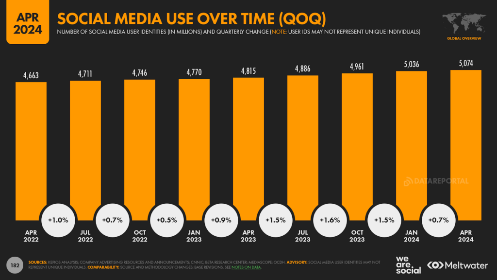
Kepios analysis reveals that social media users continued to grow at a meaningful clip during the first three months of 2024, and annual growth rates are still well in excess of 5 percent.
The latest data indicate that more than a quarter of a billion unique user identities started using social media platforms over the past 12 months, taking the global total to 5.07 billion by the start of April.
For perspective, this latest global figure equates to 62.6 percent of the world’s total population, although it’s important to stress that issues such as duplicate and false users mean that our 5.07 billion user figure may not represent unique human individuals.
Data for the first quarter of 2024 suggest that user growth has slowed over recent weeks, with the 37 million additional users we’ve identified since the start of January only accounting for 14 percent of the annual increase of 259 million new users.
However, this echoes a pattern that we saw at the start of both 2022 and 2023, when social media user growth was markedly slower than it was in the second and third quarters of each year.
Social time slips
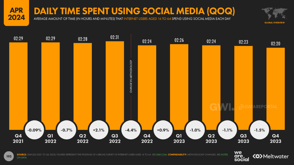
It’s also interesting to see that the amount of time the world spends using social media has fallen over the past year, with the global daily average down by 4 minutes year on year, to the current figure of 2 hours and 20 minutes.
However, this trend is more likely the result of the overall decline in media activity that we explored earlier in this analysis, and this dip doesn’t necessarily indicate any waning of interest in social media specifically.
And just as we saw with overall time spent using the internet, the amount of time that people spend using social media in top-ranking markets actually grew over the past three months.
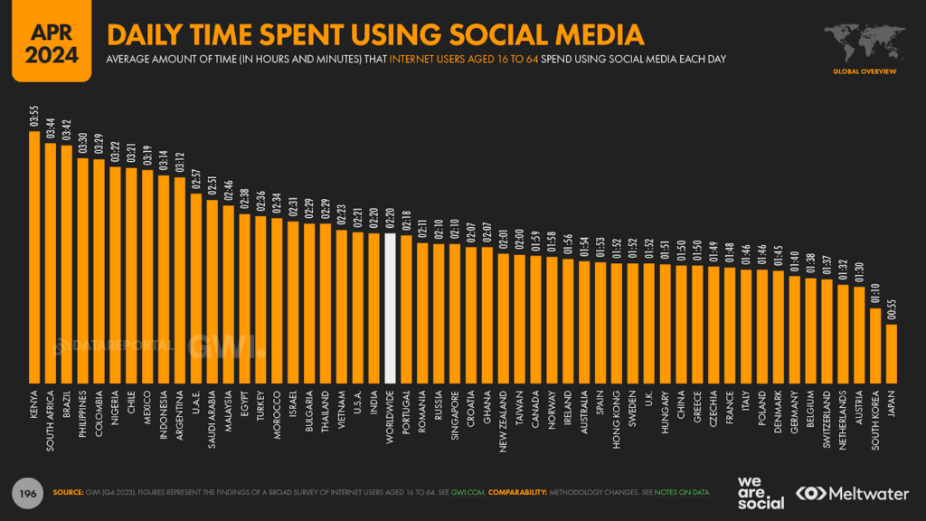
For example, Kenyans now spend an average of 3 hours and 55 minutes per day using social media, which is up from the 3 hours and 43 minutes per day that we reported back in January.
South Africans, Brazilians, Colombians, and Nigerians all say they’re spending longer on social platforms too, although Filipinos have pared their social media time by 4 minutes per day over the past quarter.
Even better social media insights
Staying on the topic of social media, we’re very pleased to bring you two excellent new datasets this quarter:
indexed social media app use
indexed total time spent per social media app
We’ll explore this data shortly, but just before we get into the numbers, let’s take a look at why these two charts are so valuable.
Comparing social platforms
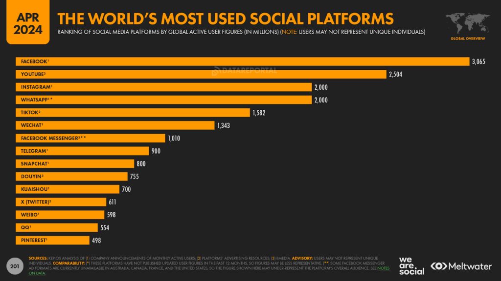
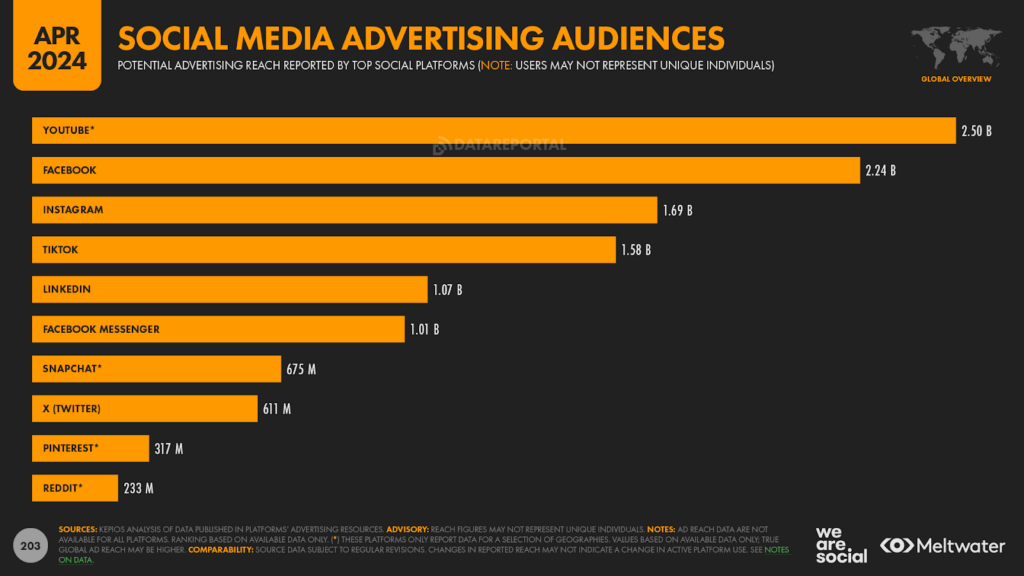
Our “World’s Most Used Social Platforms” chart remains one of the most popular datasets in the Global Digital Reports series, and understandably so; potential reach remains a crucially important metric for marketers.
However, the numbers on this chart aren’t all created equal.
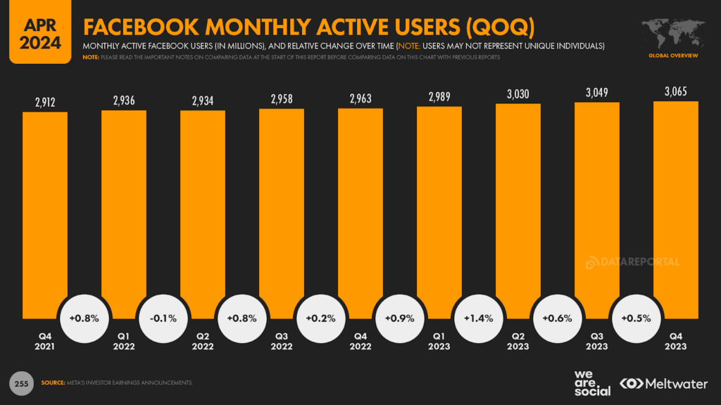
Facebook has long topped our ranking, based on the monthly active user figures that Meta publishes in its quarterly investor earnings reports.
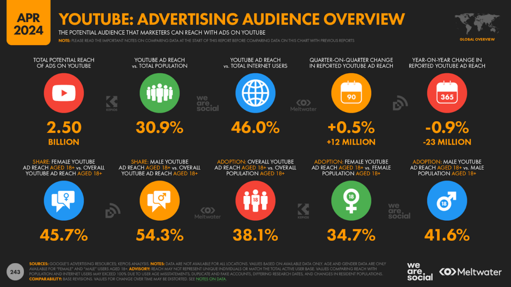
However, Google rarely publishes active user figures for YouTube, so we’ve relied on potential advertising reach figures for an indication of how many people use YouTube each month.
As we see with Facebook however, potential advertising reach and monthly active users can provide very different figures.
For example, Meta’s Q4 2023 investor earnings announcement reported that Facebook had 3.065 billion monthly active users (MAUs).
But the platform’s own advertising resources report that potential Facebook advertising reach sits at 2.244 billion today – a figure that equates to just 73 percent of the platform’s reported MAUs.
There may be various reasons for this difference, but the discrepancy between the two figures highlights the fact that monthly active users and advertising reach are quite different metrics.
Our analysis suggests that the difference between reported MAU and ad reach varies meaningfully from platform to platform, so we can’t apply a universal ratio to ad reach numbers in order to identify an MAU figure for the same platform (or vice versa).
However, if we were to apply Facebook’s 73 percent ratio to YouTube’s reported ad reach figure, it would point to a YouTube MAU figure of around 3.42 billion – more than 10 percent higher than the MAU figure reported by Facebook.
To be clear, this 3.42 billion figure is pure conjecture, and until Google decides to publish a more recent MAU figure for YouTube, such numbers are nothing more than “informed guesses”.
But therein lies one of marketers’ most common frustrations: how can we compare opportunities if we don’t have a representative basis for comparison?
And that’s exactly what our new index charts are designed to address.
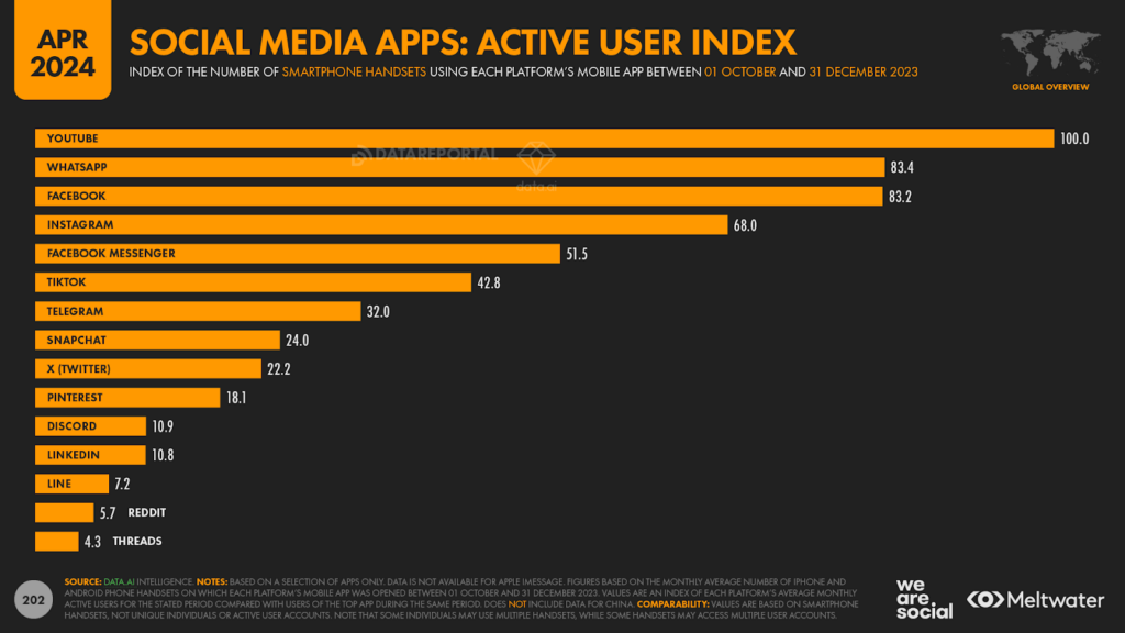
Social media apps: active user index
With help from the wonderful folks at data.ai, we’ve added a new dataset in this quarter’s report that compares the numbers of monthly active app users of some of the world’s top social media platforms.
This dataset allows us to compare social platforms on a more even footing, based on active use of each platform’s mobile app.
These numbers still have a few challenges (I’ll explain those below), but based on my decade-and-a-half of exploring digital data, these figures offer some of the most representative and informative social media insights I’ve seen.
So what does the data tell us?
The world’s most used social media apps
data.ai’s insights put YouTube at the top of the worldwide rankings when it comes to active use of social media apps, and by quite a meaningful margin.
For reference, the figures shown on this chart are indices – they’re not absolute user numbers – and the top platform will always score exactly 100, regardless of how many users it actually attracts.
Meanwhile, a platform that scores an index 50 has exactly half the number of monthly active app users as the top platform does.
So, as we can see in the chart below, this data suggests that WhatsApp and Facebook both attract roughly 83 percent of the total monthly active app users that YouTube does.
Meanwhile, Instagram’s mobile app attracts 68 percent of the monthly users that YouTube’s app attracts, which in turn means that Instagram attracts 81.7 percent of the app users that Facebook does (i.e. 68.0 vs 83.2).
The most intriguing number for me on this chart is the figure for TikTok, which is meaningfully lower than we might expect based on metrics such as the platforms’ own ad reach data.
However, I was also interested to see that Discord attracts almost 11 percent as many app users as YouTube does, which reinforces a hypothesis I proposed in January that Discord may now have somewhere between 300 million and 400 million monthly active users.
For full disclosure, this dataset still has a few caveats.
Firstly, all figures rely on third-party data, and they may not match the app usage data reported by the platforms themselves.
However, because all of the figures in this index have been collected by the same company (data.ai) using the same methodology, they enable powerful, like-for-like comparisons.
Secondly, please remember that mobile app usage is quite different to overall platform usage (e.g. MAUs).
On the one hand, our analysis of data published by the platforms themselves indicates that more than 98 percent of the monthly active users of Facebook and Instagram use the respective platform’s mobile app for at least some of their platform activity.
However, some other platforms – notably Reddit – see a higher proportion of browser-based activity, and this may result in those platforms being somewhat under-represented in this app usage data.
Next up, for technical reasons, we’re unable to collect data for users in China in the same way that we do for users in the rest of the world, so we’ve omitted China entirely from this dataset.
This means that we cannot include insights for China-centric apps such as WeChat, nor can we include any Chinese users of the platforms that we do feature.
And lastly, data are currently unavailable for Apple’s iMessage, so we can’t include that in the ranking either.
However, our analysis indicates that iMessage would rank quite highly in this index if such data were available.
But none of these technicalities diminish the value of this dataset, especially when you use it alongside all of the other great data for the same platforms that you’ll find elsewhere in this quarter’s report.
For example, we now include this handy chart too, which compares platform-reported values for potential advertising reach across some of the world’s top social platforms.
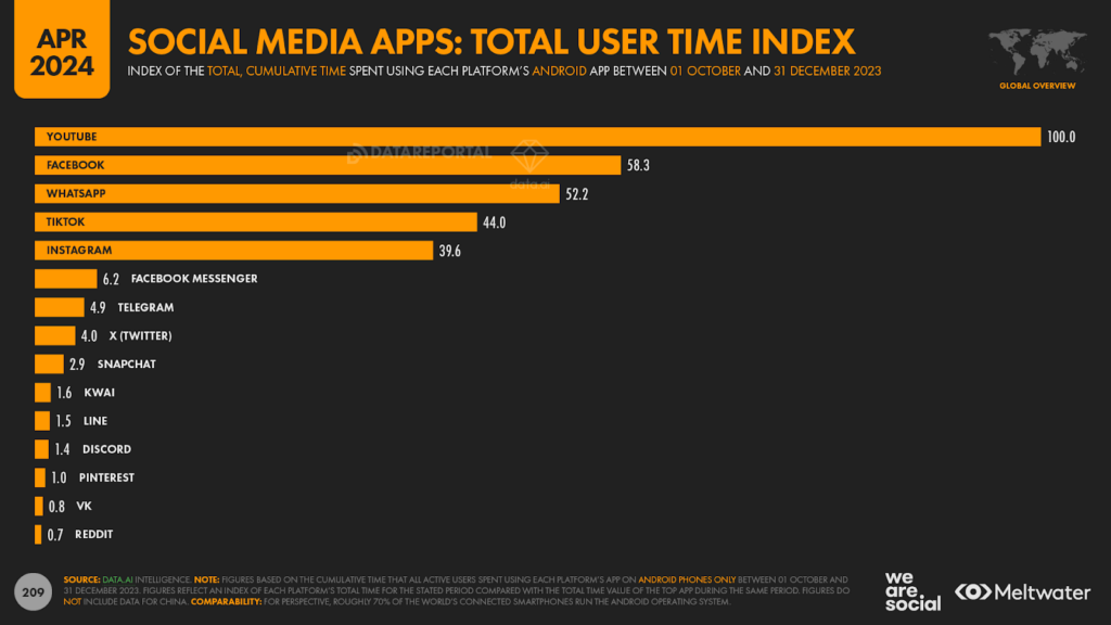
Social media apps: total user time index
Our app user index offers some excellent new perspectives, but user numbers only tell us part of the story about people’s platform behaviours.
And in order to get the complete picture, we also need to know how often people use each platform, and for how long.
Fortunately though, data.ai has us covered here too.
We’ve been sharing their insights into the average time spent per user for a while now, but this quarter, we’re augmenting that dataset by including an index of total user time as well.
This new set of data.ai figures allows us to compare the cumulative time spent by all users who have accessed each of the top social media apps in recent months.
It’s important to stress that – for technical reasons – this dataset only reflects activity on each platform’s Android app, so it doesn’t include iPhone users.
However, before you throw your hands up in despair, it’s worth remembering that Android currently powers more than 70 percent of the smartphones in use around the world.
Moreover, it’s unlikely that we’d see radically different behaviours for the same social platform on different mobile operating systems.
Even if that were the case though, operating system differences would likely affect each social platform in a similar manner, so our use of index values should even out any such anomalies.
Share of total social media time by platform
Once again, this dataset puts YouTube firmly in first place – and by an even greater margin than we saw in the active user index.
Indeed, even second-ranked Facebook doesn’t even reach 60 percent of the time that people spent using the YouTube app in the last three months of 2023.
The “reversal” of the rankings of TikTok and Instagram compared with the active user index chart is also worthy of note here, while the fact that YouTube delivers more than twice as much cumulative app time as TikTok is also a top takeaway.
But more than any individual number or ranking, it’s the distribution of values on this chart that really caught my attention – and in particular, how quickly the index values drop as we go down the ranking.
There’s a certain logic to this; after all, there are only a certain number of hours in the day, and people can’t spend hours and hours on every single platform.
However, despite that logic, I was still surprised by the size of the disparity between the top five platforms and all of the others.
Likewise, the fact that some platforms appear in this total time index, but not in the active user index, is also worthy of note.
For example, Kwai doesn’t feature in the top 15 social media apps by active users, but it ranks tenth at a worldwide level when it comes to cumulative time spent [note that – just like our active user index – this data doesn’t include data for China, so these figures and rankings haven’t been skewed by Kuaishou].
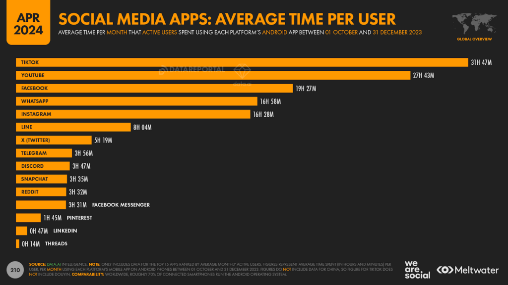
Social media apps: average time per user
I was also interested to see the difference in the rank order of the total time index compared with the rank order for average time per user.
TikTok still commands top spot in this particular dataset, with the typical user of TikTok’s Android app spending 31 hours and 47 minutes using the app each day in the final three months of 2023.
That’s more than 2 hours less than the figure we reported back in January, but it’s still more than 4 hours per month more than the current average for YouTube.
In line with the overall decline in social media time that we explored earlier in this analysis, it’s perhaps not surprising to learn that many of the apps on this chart have seen average time per user fall over the past three months.
There are some exceptions to this downward trend though, with X (Twitter) being a noteworthy example.
data.ai’s intelligence indicates that the typical X user increased their activity by an average of 40 minutes per month in the last quarter of 2023, resulting in a quarter-on-quarter increase of roughly 14 percent.
And staying on the subject of X, various data points in this quarter’s report suggest that X is doing better than media headlines suggest.
Yes, the platform’s ad reach has declined again this quarter, and fewer people cited X as their “favourite” platform in this quarter’s data compared with our January report.
However, these declines are nowhere near as dramatic as the mainstream media might have you believe, and while that might not be enough to bring the advertisers back en masse, there’s plenty of evidence to suggest that X continues to attract a sizeable and engaged user base.
Making sense of social media use
I’ve already highlighted the need to consider various data points when constructing a social media plan, so I’d like to bring a few more charts to your attention.
In the interests of time, I won’t go into these datasets in any great detail, but I’d encourage you to use them all when exploring the “best” mix of social channels for your needs.
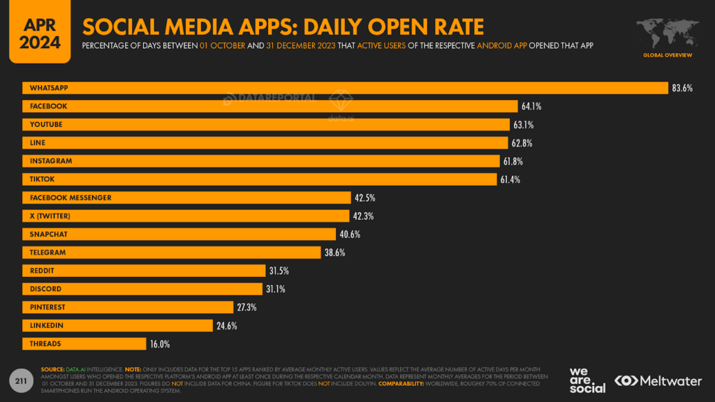
Daily open rate
Platform usage frequency is a critically important topic for bands in certain categories, so the daily open rate should be a key consideration if regularity of contact is an important objective.
WhatsApp is the only top platform to see more than two-thirds of its active user base open the app each day, but several of the other top platforms see more than 60 percent of active users open the app on a daily basis.
However, it’s also important to remember that the “half life” of content varies considerably by platform.
For example, data suggests that the typical YouTube video remains in feeds for close to 9 days after publication, whereas the typical tweet only survives for 43 minutes.
As a result, you need to factor both usage frequency and content half-life when planning a content calendar for any given platform.
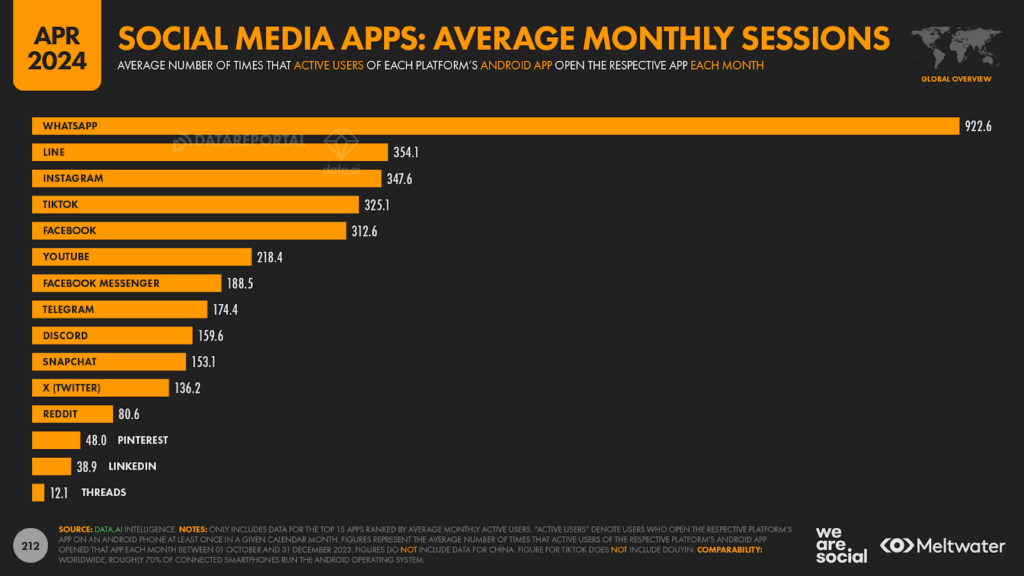
Average monthly sessions
It’s also interesting to see how many times people open each app in a given month.
Note that the nuances of platform behaviour mean that we can’t use these particular figures as a proxy for frequency.
For example, a single WhatsApp “chat” may involve a user opening and closing the app multiple times over the space of a few minutes, but – once that chat has finished – they may not open the app again for another day or so.
Similarly, people may engage in multiple YouTube and TikTok sessions over a few hours each evening, but they may not open the app at all during the day (e.g. when they’re at work or school).
It’s also well worth exploring these figures in the context of average session duration, which we’ll get to next.
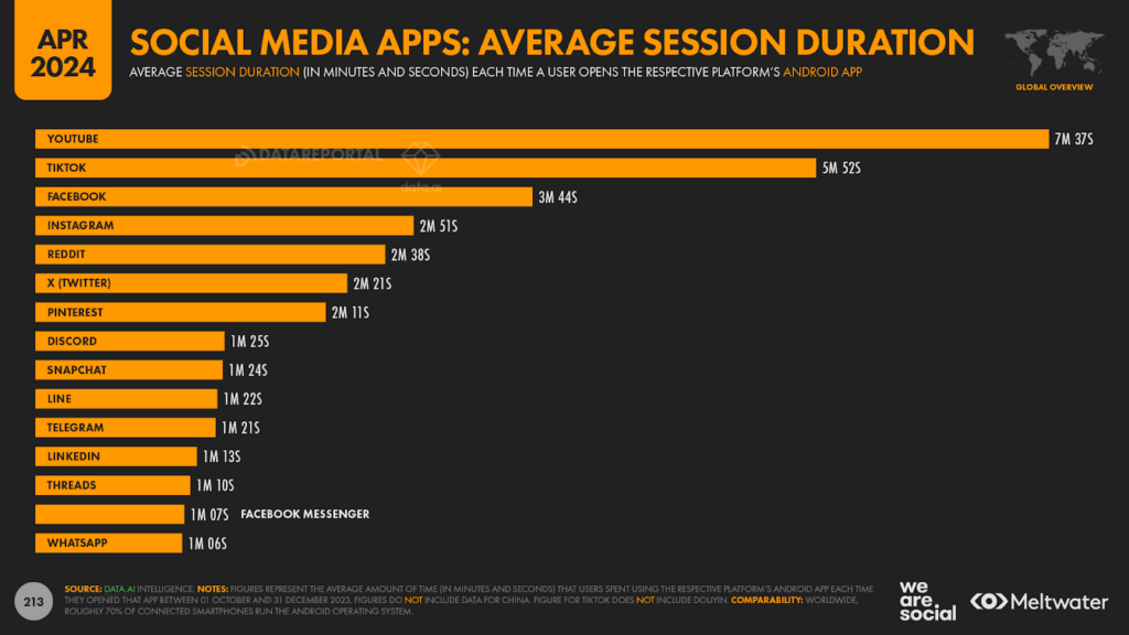
Average session duration
The length of each app session is also a critically important consideration for marketers.
For example, a user who spends 1 minute using one particular platform will likely see considerably fewer ads than a user who spends 10 minutes using another platform.
These figures also tell us something about people’s content expectations when they open each app.
For example, if you want people to watch a longer video, it might make more sense to publish that video to YouTube instead of Instagram.
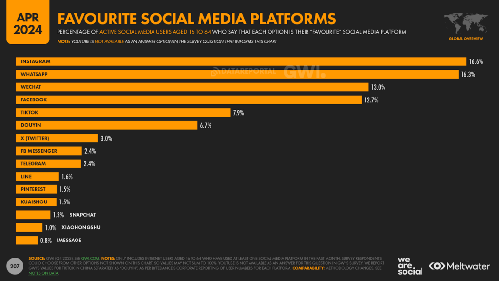
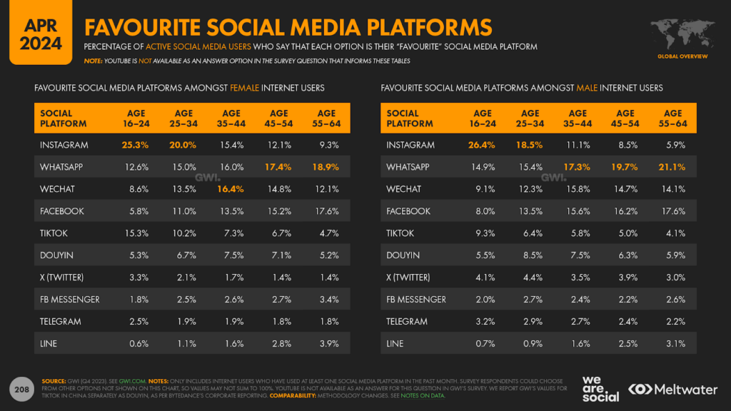
Social platform affinity
And finally, it’s always worth considering where each platform sits in people’s hearts.
GWI’s latest data reveals that Instagram has consolidated its position at the top of the affinity rankings, with 1 in 6 working-age internet users around the world now saying that it’s their “favourite” social platform.
That’s more than twice as many as the number who chose TikTok, but it’s worth noting that TikTok’s popularity continues to grow too.
These platform preferences do vary meaningfully by age, but not always in the ways that marketers expect.
For example, at a worldwide level, women aged 16 to 24 are still 60 percent more likely to choose Instagram over TikTok, while men in the same age group are more than 2½ times as likely to choose Instagram over TikTok.
However, India’s ongoing TikTok ban plays an important role in shaping these global figures – especially amongst younger women – and our analysis suggests that if Gen Z women in India had unfettered access to TikTok, we’d likely see similar preference figures for TikTok and Instagram within this demographic.
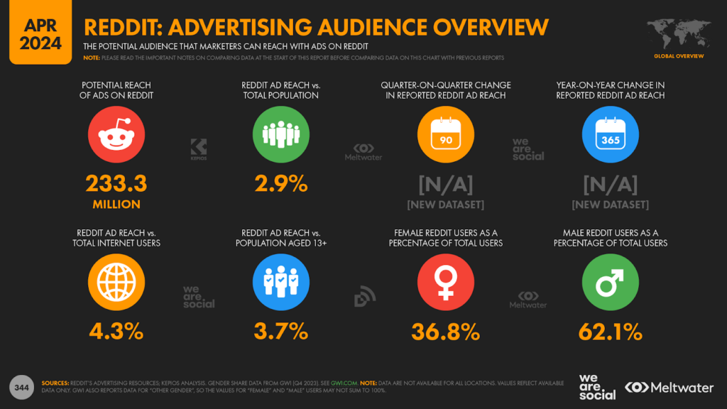
Exploring Reddit’s advertising audience
In addition to the excellent new datasets that I detailed above, we’re delighted to introduce yet another new dataset in this quarter’s report, which provides essential insights into Reddit’s advertising audience.
Reddit’s audience data isn’t as detailed as what we see for platforms like Facebook and Youtube, but it still reveals plenty of actionable insights – and a few surprises.
Just before we look at that data though, it’s worth highlighting that Reddit now claims more than half a billion monthly uniquevisitors.
This fresh figure was revealed in the platform’s recent IPO documentation, in which the company also revealed that it attracts an average of more than 73 million unique visitors per day.
The monthly unique visitors figure isn’t the same as monthly active users, because visitors do not necessarily need to create an account or log in in order to be included in the visitors figure.
However, 500 million unique monthly visitors is still an impressive achievement, and is testament to the growing appeal of Reddit’s platform.
Reddit’s global audience
But what does Reddit offer in terms of advertising opportunities?
Well, the platform recently expanded the data included in its self-service advertising resources, so we’re now able to see the platform’s own figures for potential advertising reach.
Note that there are a few odd gaps in Reddit’s reach data though, most notably for countries in Eastern Europe.
We also identified some anomalies in the reported gender data, so we’ve substituted that with demographic insights from GWI.
However, the rest of the data is illuminating.
Overall, Reddit reports potential global ad reach of 233 million, which equates to 4.3 percent of the world’s total internet user base.
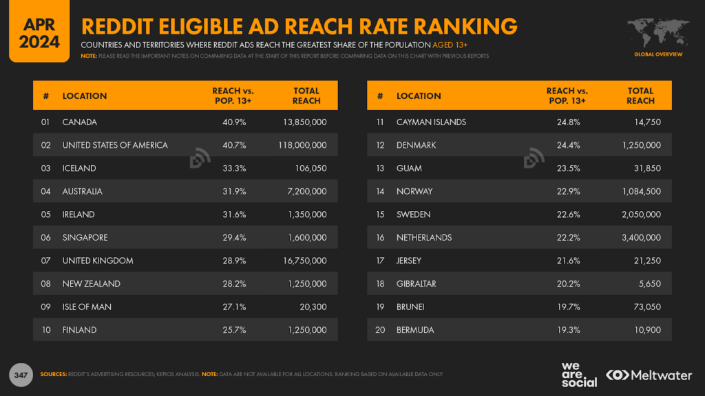
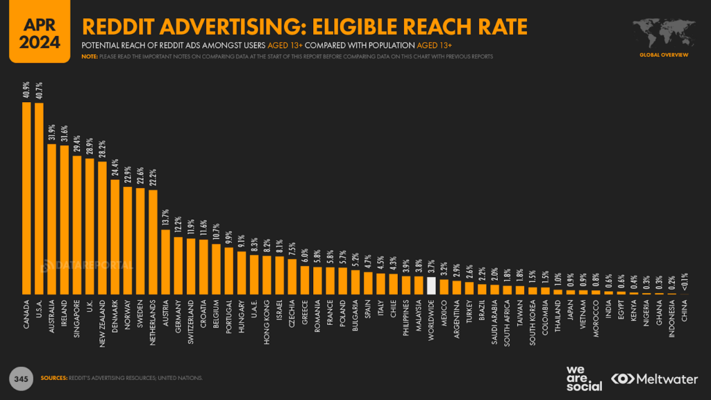
Reddit’s top countries
Canada just pips the United States to claim top spot in the country rankings by eligible reach, which compares Reddit’s reported ad reach with the number of people aged 13 and above in each country.
Both countries have an eligible reach rate in excess of 40 percent though, while Australia, Iceland, and Ireland all see eligible reach rates in excess of 30 percent.
Reddit ads also appear to reach more than 20 percent of eligible populations across the UK and the Nordics, but figures are meaningfully lower across the rest of Europe, as well as for Asia, the Middle East, and Latin America.
The Reddit marketing opportunity
These figures might not sound as impressive as those we see for YouTube or Facebook, but it’s important to remember that Reddit offers something of a unique environment for marketers.
In particular, people visit Reddit to actively engage with their peers, and while their conversations can sometimes feel intimidating from a marketer’s perspective, the platform offers a range of contexts and environments that we can’t find anywhere else.
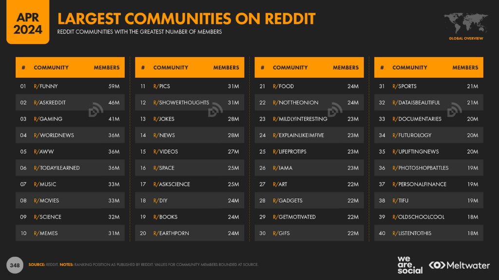
There are also several popular communities – known as “Subreddits” – that could be particularly appealing to brands.
For example, r/DIY boasts 24 million members, while r/Food attracts a similar number of participants.
And furthermore – in addition to being a great place for people to discover brands – Reddit communities are a great place for brands to discover people.
Admittedly, for the uninitiated, Reddit can take some getting used to, especially because it has its own language, shared references (e.g. memes), and rules of behaviour.
However, if you’re willing to invest a bit of time, you can easily learn as much from reading a handful of Reddit posts as you can from focus group research – and at a fraction of the price.
So, if you haven’t explored Reddit recently, now might be a good time to take a fresh look.
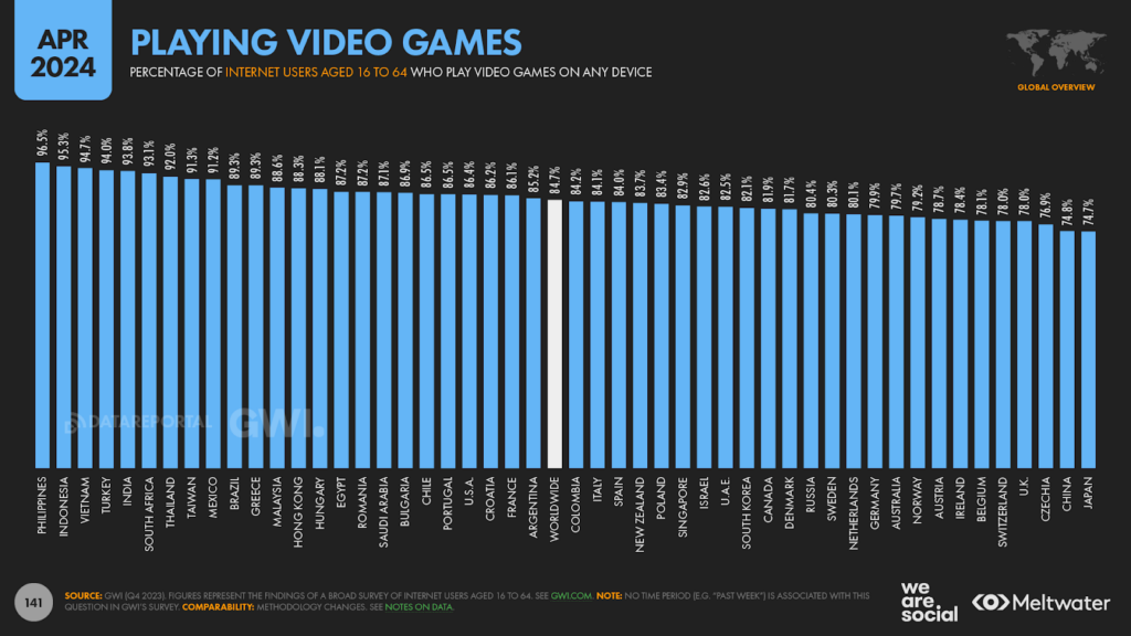
Gaming on the up
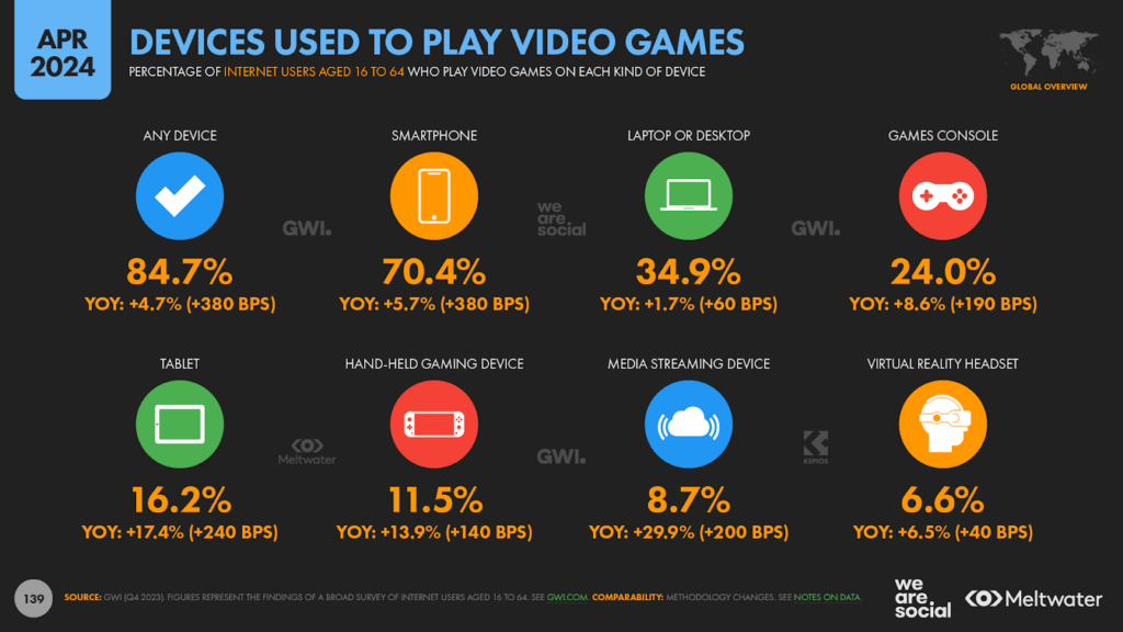
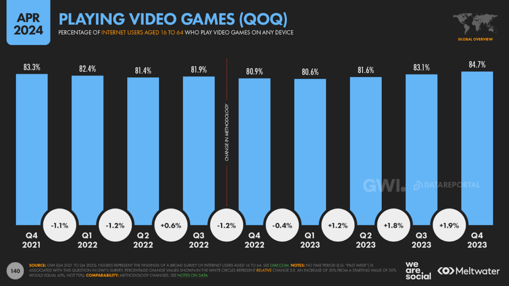
GWI’s latest wave of research reveals an uptick in the number of people saying that they play video games.
84.7 percent of respondents answered in the affirmative in Q4 2023, which is 4.7 percent (380 basis points) higher than the figure for this time last year.
This is the highest gaming figure we’ve seen in the past 3 years, with recent increases largely driven by growth in the number of people playing video games on a smartphone.
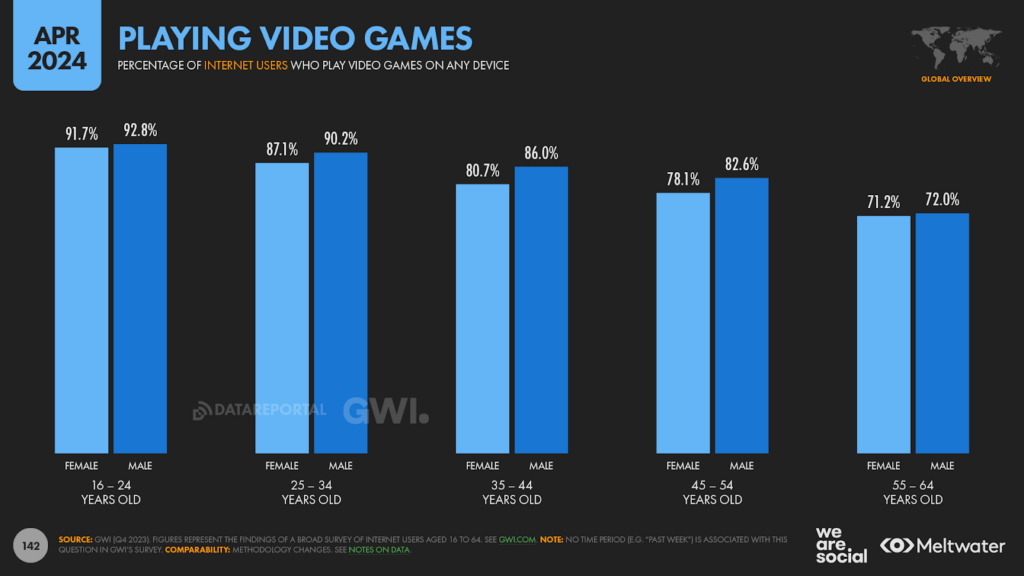
And what’s more, this growth in video gaming is evident across all age groups, including older generations.
Indeed, GWI’s data shows that more than 7 in 10 internet users between the ages of 55 and 64 now play video games.
It’s worth highlighting that the majority of gaming activity amongst older generations takes place on smartphones, but it’s also interesting to note that internet users aged 55 to 64 spend an average of more than 30 minutes per day using a games console.
Gaming by country
Southeast Asians are the world’s most “active” gamers, with the Philippines, Indonesia, and Vietnam taking all three of the top spots in the latest rankings.
However, in something of a counter to stereotypes, Japan and China see the lowest levels of video game adoption.
Roughly three-quarters of working-age internet users in these countries say that they play video games though, so the vast majority of people in these countries can still be considered “gamers”.
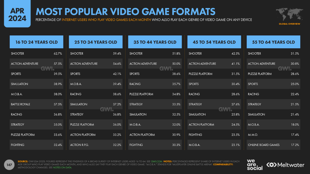
Most popular video games
Shooter formats remain the most popular genre of video game, with more than half of active gamers saying that they play games in this category.
At an overall level, action adventure titles rank second, while sports place third overall.
However, puzzle games are more popular than sports titles amongst older generations, despite barely making the top 10 amongst users aged 16 to 24.
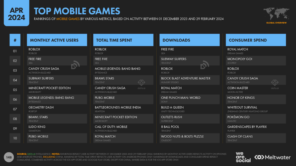
Looking more closely, the latest insights from data.ai reveal that Roblox remains the world’s most popular mobile game, with the hugely popular title topping the rankings for both active user numbers and total time spent.
Roblox continues to attract new players too, with data.ai reporting that the game saw the largest increases in both monthly active users and total time spent of all game apps between December 2023 and February 2024.
Evolving digital priorities
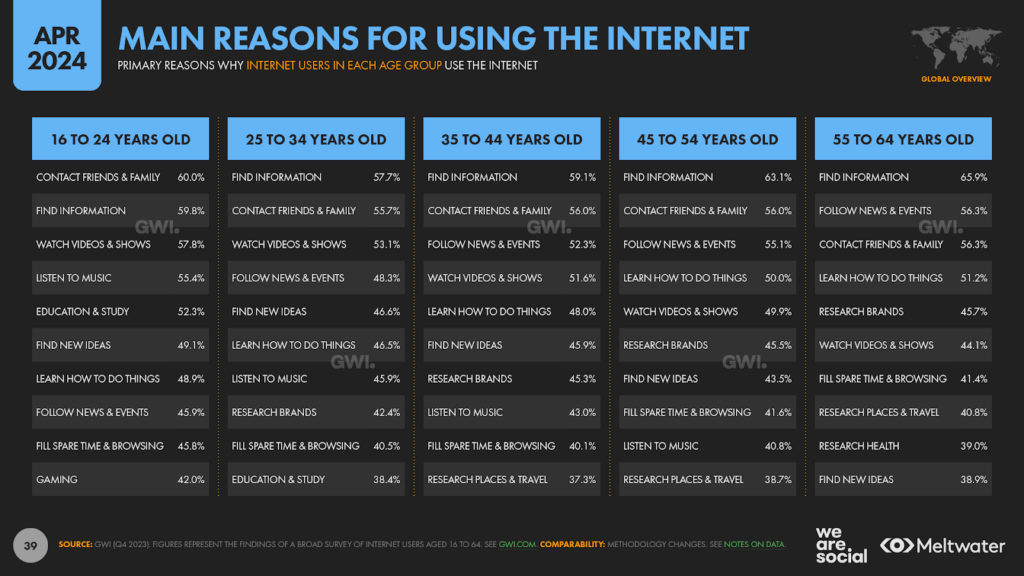
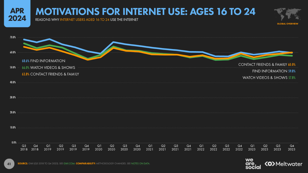
As I noted earlier, “staying in touch with friends and family” is now the primary reason for going online amongst internet users aged 16 to 24.
For clarity, there’s not much difference between the top two motivations in this age group – 60.0 percent for contacting friends and family, versus 59.8 percent for finding information – and we may see these categories swap rank positions again next quarter.
However, this is the first time we’ve seen “finding information” slip to second place in the rankings, and this marks an interesting evolution in the digital priorities of younger internet users.
Evolving motivations
In the Q3 2018 wave of GWI’s research, “finding information” was the top digital motivation cited by the world’s 16 to 24 year olds, with 68.6 percent of the cohort selecting this option.
“Watching videos, TV shows, and movies” ranked second at 66 percent, while “staying in touch with friends and family” ranked third, with 63.8 percent.
However, as we’ve just seen, the rank order looks quite different today, with “staying in touch with friends and family” coming out as the top option.
It’s interesting to note that the values for all of these options has declined steadily over the past few years, although values have started to rise again after their most recent lows in Q2 2022.
Connect vs. consume
But it’s the contrast between socialising and entertainment that’s worth exploring in more detail.
As we saw earlier in this analysis, there’s a widely held perception – largely driven by mainstream media headlines – that young people are more likely to engage in mindless “doom-scrolling” of video feeds than they are to interact with their peers.
However, this data suggests that – at least in terms of their initial intentions – young people are actually more likely to go online seeking social connection than they are to look for video content.
It’s important to highlight that both activities are still big drivers – remember that they’re not mutually exclusive – and the difference between the two is also relatively small (60.0 percent vs. 57.8 percent, respectively).
But the fact that we’re seeing younger people putting greater emphasis on social connection is an important consideration for marketers and policymakers alike.
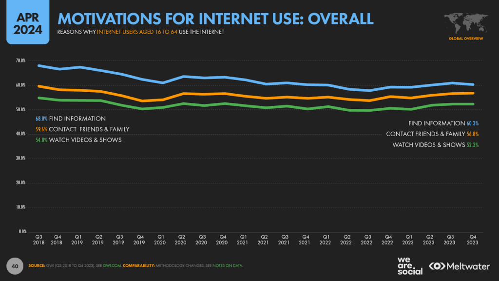
It’s also interesting to note that trends in the rank order of motivations amongst younger people are different to those that we see for working-age internet users as a whole.
GWI’s data reveals that “finding information” remains the primary motivation for going online across all internet users, and – while the gap has narrowed over the past 5 years – “staying in touch with friends and family” still trails by 3½ percentage points.
Intentions vs. actions
However, a related dataset in GWI’s survey tells a slightly different story to this motivations data.
The figures we saw above looked at the reasons why people use connected tech, but the next set of data looks at what people say they actually do once they get online.
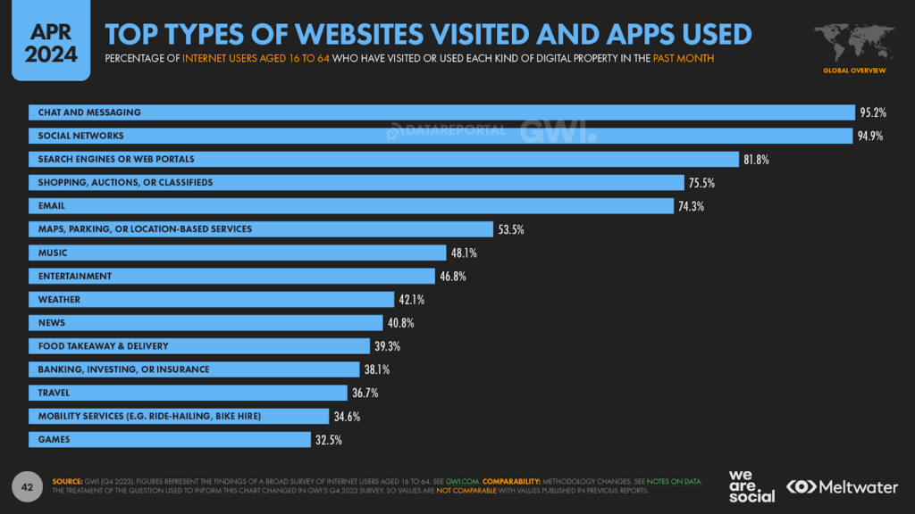
At an overall level, chat and messaging platforms are the most popular types of online service used by the world’s working-age internet users, with more than 95 percent of GWI’s global survey base saying that they use these platforms each month.
Social networks come a close second, with 94.9 percent reporting that they’ve visited one of these platforms in the past 30 days, while search engines and web portals rank third, at 81.8 percent.
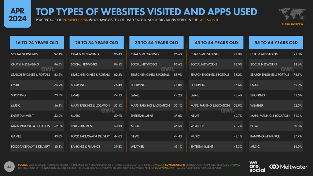
However, the rank order of the top two activities is reversed amongst internet users aged 16 to 24, with these younger people saying that they’re more likely to visit social networks than they are to use messaging platforms.
Once again, the gap between these two answers is quite small, but it’s still interesting, precisely because media headlines continue to imply that young people aren’t “social networking” anymore.
But that’s not the only myth-busting finding in these latest rankings.
For example, younger people say that they’re more likely to use an email service than they are to use an online music platform (75.9 percent vs. 56.1 percent, respectively).
It’s important to reiterate that the approach and methodology associated with this specific question in GWI’s survey has changed since last quarter though, so note that you shouldn’t compare these latest figures with the (seemingly similar) numbers featured in our January report.
The impact of evolving search behaviours
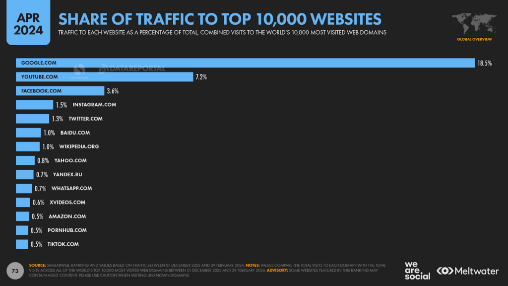
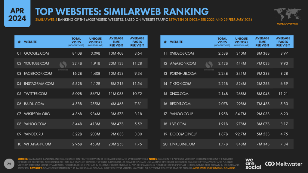
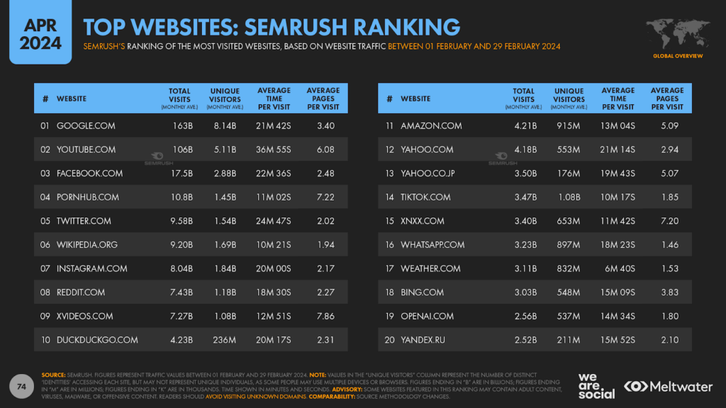
Data from both Semrush and Similarweb shows that Google.com is still by far the most popular destination on the internet.
The two companies offer quite different figures for their key metrics – total visits and unique visitors – but the overall takeaway is still the same: no other domain even comes close to matching Google’s web dominance.
To put the search engine’s position in perspective, Similarweb’s data shows that Google accounts for 18.5 percent of all the traffic to the world’s 10,000 most visited websites, which means that more than 1 in 6 page views across all of these sites goes to Google.com.
And while Google doesn’t take first place in data.ai’s latest mobile app rankings, it does rank third.
Moreover, Chrome ranks second amongst the world’s most used mobile apps, and with Google.com still the world’s top destination in mobile browsers, it’s safe to say that Google search is one of the top two activities on mobile today, regardless of whether people use native mobile apps or the web.
Google search slips
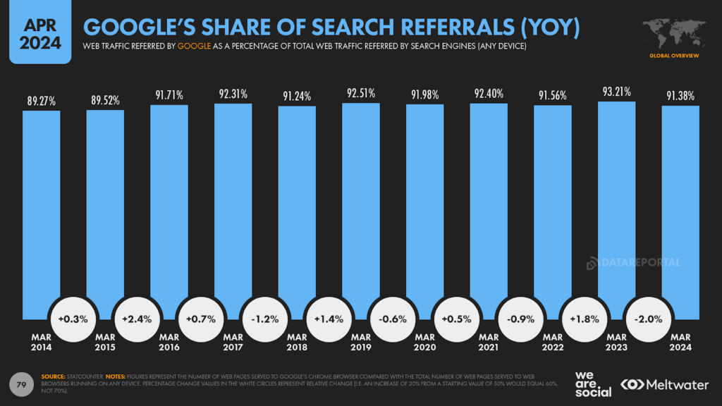
However, despite its dominance, Google has now slipped to its lowest share of web referrals in more than three years.
Statcounter reports that Google.com was responsible for 91.38 percent of search engine referrals in March 2024, matching a low that we last saw in December 2020 [note that this 2020 value doesn’t appear on the chart below].
Statcounter’s data reveals that Google’s share of search engine referrals does tend to fluctuate over time, so this may just be part of a normal “cycle” of activity, and may not indicate the rise of any specific competitor.
Moreover, outside of China, Google still accounts for more than 10 times as many search referrals as all other search engines combined.
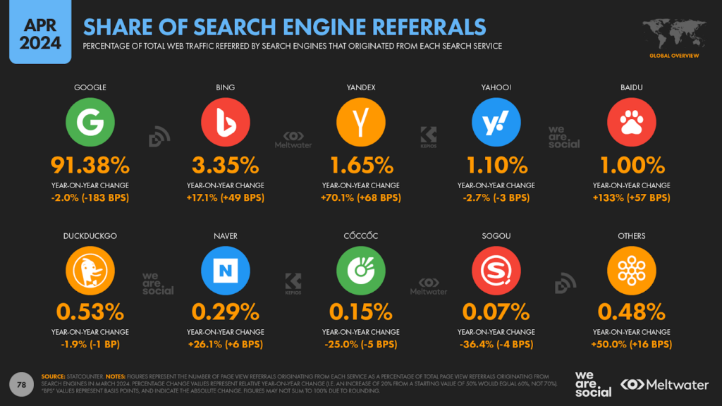
But having said that, Microsoft’s Bing has seen growth in its share of search engine referrals over the past year, with the latest value of 3.35 percent roughly half a percentage point higher than the share it claimed this time last year.
The integration of Microsoft’s “Copilot” AI features into Bing may have played a role in this rise, but Bing doesn’t appear to be the primary cause of Google’s decline in share.
In fact, both Yandex and Baidu increased their relative share of search engine referrals by more than Bing did over the past year, even though the two services still only account for a fraction of the overall market (1.65 percent and 1.00 percent, respectively).
The role of web search
I’ve dedicated plenty of attention to the rise of “alternative” search behaviours in my recent analyses of the Global Digital Reports series, and these trends are undeniably important.
However, it’s also critical to understand that “traditional” web search continues to be a primary driver of traffic on the internet.
For perspective, data published by Similarweb indicates that most web traffic is “direct”, and can be attributed to people either typing a URL directly into their browser, or clicking on a hyperlink in an application other than a web browser (e.g. a native email program or a PDF viewer).
Overall, direct site visits account for well over half of all web activity, which means they’re responsible for a greater share of web traffic than all other sources combined.
But despite the prevalence of direct traffic, organic search ranks an important second, and this traffic source is particularly relevant when it for new site visitors, who may not know the URL of the site they’re looking for – or even what that site might be.
Sources of web traffic
It’s also important to highlight that the relative importance of traffic sources varies meaningfully by device.
Based on Similarweb’s analysis of the 100 most visited web domains, direct traffic accounted for two-thirds – 66.7 percent – of total visits.
For context, these top 100 domains accounted for roughly 53 percent of total web traffic to the top 10,000 domains between December 2023 and February 2024.
But for comparison, direct traffic accounted for 81.0 percent of visits to the top 100 desktop sites over the past 3 months, whereas the figure for the top mobile sites is considerably lower, sitting at just 53.7 percent [note that the term “desktop” refers to both desktop and laptop computers in this instance].
Organic search ranks second in terms of share of traffic across both computers and mobiles, accounting for 23.3 percent overall.
Once again however, the relative share is markedly different by device.
According to Similarweb’s data, organic search was responsible for 11.8 percent of traffic to the top desktop sites, while it drove 33.8 percent of traffic to the top mobile sites.
There may be various reasons for this difference, but keyboard accessibility likely plays a primary role.
For example, it’s considerably easier to type a fiddly website URL using a physical keyboard than it is to type the same URL using a smartphone’s virtual keypad.
As a result, people are more likely to resort to using search engines to access websites on mobile devices, even if they already know which site they want to visit.
But regardless of the device, direct and organic search are responsible for 90.1 percent of web visits at a worldwide level (92.9 percent for desktop sites, and 87.5 percent for mobile sites).
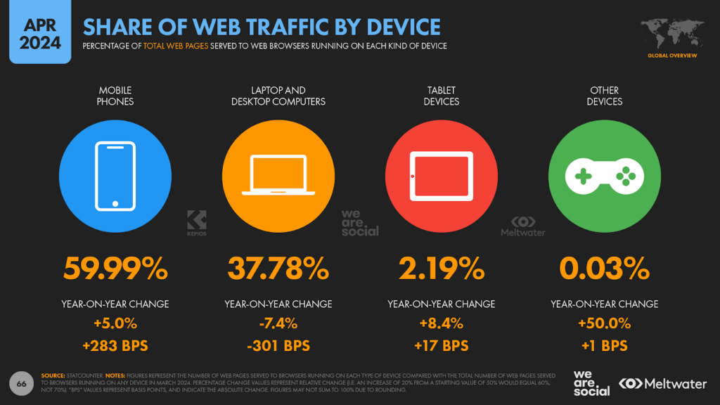
And for added perspective, Similarweb’s data suggests that 59.2 percent of total web traffic now originates from mobile phones, which is very similar to the 59.99 percent figure published by Statcounter.
The surprising truth about digital ads
But what about paid search?
Well, this is where we uncover one of the most astonishing findings in this dataset.
For context, as with organic search, paid search is responsible for a considerably higher share of mobile traffic versus desktop traffic.
More specifically, over the past 3 months, paid search delivered 0.32 percent of desktop traffic to the top 100 desktop domains, while it drove 0.86 percent of mobile traffic to the top 100 mobile domains.
Meanwhile, overall, paid search was responsible for 0.64 percent of traffic to the web’s top 100 domains, regardless of device.
Yes, just 0.64 percent.
Let’s take a moment to comprehend the significance of that figure.
Despite the fact that Google alone generatedUS$175 billion in paid search revenues in 2023, paid search clicks still only account for a tiny fraction of global web traffic.
But that still leaves the source of just under 10 percent of visits unaccounted for… so where does the remaining web traffic come from?
Other traffic sources
Our analysis of Similarweb’s overall traffic data suggests that the next largest share – 4.55 percent – comes from “referrals”, which typically identifies hyperlinks on other websites that aren’t associated with display ads.
Social media isn’t far behind referrals though, with both organic and paid social clicks accounting for a combined 4.13 percent of traffic to these top 100 domains over the past 3 months [we’ll return to the paid vs. organic split in a moment].
And lastly, links from web-based email activity accounted for 0.47 percent, while web-based display ads accounted for a paltry 0.13 percent.
In other words – despite their ubiquity – banner ads drive barely 1 in every 750 visits to these top domains
But talking of ads, let’s return to social media for a moment.
Similarweb’s data doesn’t break social traffic out into paid and organic, but Semrush’s data does allow us to see these splits.
Note that Semrush and Similarweb use slightly different data and methodologies though, so this analysis isn’t quite a like-for-like take on the data that we explored above.
Caveats aside, across the top 200 web domains by total traffic, Semrush puts the ratio of organic vs. paid social traffic at roughly 250 to 1 in organic social’s favour.
However, the share of traffic originating from paid social tends to increase significantly as total monthly traffic decreases, which follows a certain logic: the smaller the site, the more likely it is that the site needs to invest in paid advertising in order to attract visitors.
And in fact, our analysis of traffic to the websites of the world’s top 100 brands – as ranked by Interbrand – indicates that even big companies rely much more heavily on paid social media activities than these overall ratios suggest [note that “mega-sites” like Google and Facebook tend to have a disproportionate impact on overall figures].
But even after recalibration, organic social still accounts for far more web traffic than paid does, even amongst the world’s biggest advertisers.
Figures vary significantly from site to site, as well as by geography and by industry.
However, as a very broad rule of thumb, once we look beyond the top 50 brands, data suggests that organic social typically drives roughly 20 times as much traffic as paid social does.
And more broadly, the overall combination of different kinds of paid digital advertising – including paid search, paid social, and display ads – typically only drives between 1 percent and 2 percent of traffic to brand websites.
However, it’s critically important to note that websites which are primarily designed to deliver commercial conversions (e.g. on-site sales) typically rely far more heavily on paid media.
For example, a recent report from Contentsquare found that a hefty 1 in 3 visits to such web properties come via paid channels, suggesting that conversion-oriented websites rely 20 times more heavily on paid media to attract visitors than the typical brand website does.
And moreover, the more a commercially oiented site depends on mobile traffic, the higher the ratio of paid traffic appears to be.
Implications: traffic sources in context
So, what can we learn from this data?
Well, the key takeaway is that “conventional” search is still essential for any marketer hoping to drive traffic to a website.
Despite the rising importance of social search, organic search engine activity is still responsible for roughly 5 times as many referrals as paid and organic social combined.
Having said that, it’s critically important to remember that social search activities don’t necessarily need to deliver a web visit in order to achieve their intended outcomes, because not all marketing objectives require a “click-through”.
For example, a well structured brand-building video can deliver all of its intended outcomes within an on-platform view, directly within social media search results.
However, if you’re looking to drive social searchers “off platform” – whether that’s to your own website, or to an online shopping destination – you probably want to embrace both conventional and social search activities.
The rise of the even smaller screen
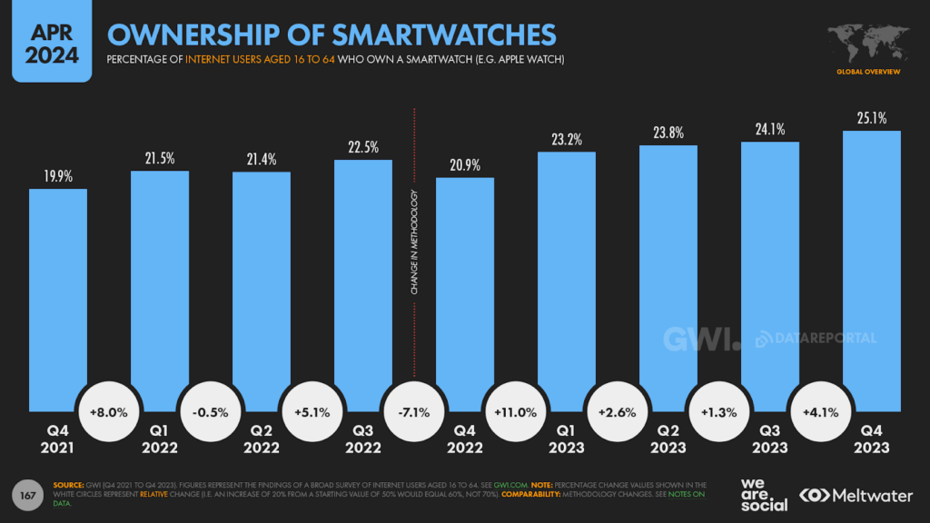
Data shows that ownership of smartwatches continues to increase.
More than 1 in 4 online adults tell GWI that they now own one of these devices, with ownership increasing by a relative 11.6 percent over the past 12 months.
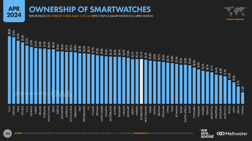
The UAE sees the highest levels of smartwatch adoption, with 38 percent of the country’s online adults answering in the affirmative in Q4 2023.
Czechia ranks second, while India comes in third.
However, the USA only ranks fifth, while Japan – the original purveyor of portable electronic gadgetry – trails third-to-last, with just 12 percent adoption.
This rank order might come as a surprise to many readers, especially those who might associate smartwatches with the high-end devices made famous by the likes of Apple and Samsung.
However, smartwatches now come in a wide range of options that cater to a variety of budgets.
Indeed, with specific regard to India’s high ranking in this dataset, it’s worth highlighting that both Flipkart and Amazon India currently list a wide range of smartwatch products below the ₹1,500 (≈ USD $18) price point.
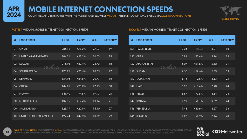
Internet speeds
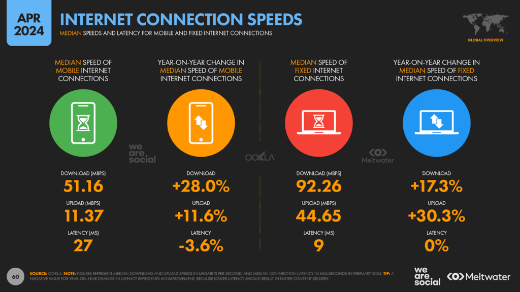
The latest Speedtest data from Ookla shows that the global median mobile connection now exceeds 50 Mbps, with that average download speed increasing by 28 percent over the past 12 months.
Uploads are considerably slower however, with the typical connection sending data back to the internet 4½ times more slowly than it receives it.
Qatar has the fastest download speed in Ookla’s latest data, with the typical mobile user in the country enjoying mobile bandwidth of 286.42 Mbps.
The UAE isn’t far behind though, with Qatar’s Gulf neighbours enjoying a median mobile download speed of 284.21 Mbps.
But we still see a very different picture at the other end of the spectrum, with mobile users in Timor-Leste and Cuba continuing to battle with download speeds below 4 Mbps.
Meanwhile, Ookla’s analysis indicates that the world’s fastest median mobile data connection is now roughly equal to the world’s fastest median fixed data connection.
Qatar’s mobile download speed of 286.42 Mbps is only 0.08 percent slower than Singapore’s median fixed download speed 286.66 Mbps.
And with Qatar’s mobile connections accelerating at an annual rate of 78 percent – compared with the 21 percent acceleration in Singapore’s fixed connection rate – it’s quite possible that we’ll see mobile connections start to become the fastest way to go online.
We’ve still got some way to go before that’s universally true however, and Ookla’s data shows that the global median fixed connection (92.26 Mbps) is still close to twice as fast as the median mobile connection (51.16 Mbps).
Yahoo at 30
But to wrap things up this quarter, let’s take a closer look at Yahoo!, which remains one of the longest standing – and still one of the most popular – brands on the web.
Jerry Yang and David Filo founded their “Guide to the World Wide Web” In January 1994, but renamed the service as Yahoo! In April 1994, 30 years ago this month.
Yahoo! was once the hottest property on the web, and its “portal”, search, email, and messenger services were ubiquitous by the end of the 1990s.
The company has seen more mixed fortunes since the turn of the millennium, but – despite its business woes – yahoo.com is still one of the most visited domains on the internet.
Semrush ranks the site in 12th position at a worldwide level, with 4.18 billion month visits, and 553 million unique monthly visitors.
Meanwhile, Similarweb ranks the site 8th in the world, with 3.44 billion monthly visits, and 418 million unique monthly visitors.
However, both companies also rank yahoo.co.jp in their global top 20, and – while Yahoo! and Yahoo! Japan are run as separate companies – the combined traffic of the Yahoo! “brand” would position it 6th in Similarweb’s ranking, and 8th in Semrush’s ranking.
And what’s more – in something of a shock for neophiles – our analysis of data from Similarweb, Semrush, and data.ai indicates that Yahoo! still attracts more unique users each month than ChatGPT.
So, by various accounts, Yahoo! is still more popular than AI, and it’s still hotter than the world’s top adult content sites too.
Ya-who knew?!
Web traffic data suggests a gentle decline in visits to yahoo.com over the past three years, but the brand’s primary domain has actually enjoyed something of a resurgence over the past year, with total monthly site visits increasing by roughly 15 percent between February 2023 and March 2024.
Mail remains the jewel in the Yahoo! Crown, with Similarweb reporting that the mail.yahoo.com subdomain is responsible for more than 40 percent of the site’s computer-based traffic, and 15 percent of its mobile traffic.
But Yahoo! Search is still a popular destination too, accounting for just over 20 percent of visits across all devices.
At a worldwide level, Similarweb reports that search.yahoo.com still attracts more than 1 billion monthly visits, and more than 170 million unique monthly visitors
Meanwhile, marketers may be particularly interested to know that Yahoo!’s finance portal is also very popular, with the finance.yahoo.com subdomain attracting close to 50 million unique monthly visitors over the past three months.
For context, computers – which include desktops and laptops – accounted for just under two-thirds of Yahoo!’s total web traffic over the past three months.
That’s quite different to the typical device split though – 60 percent of global web traffic now comes from mobile – and this may tell marketers something about Yahoo!’s overall demographics.
Wrapping up
That’s all (ahem) for this quarter’s mammoth analysis – thanks very much for sticking with me through all 12,000 words!
I’ll be back with you again in just a few weeks with our Digital 2024 July Global Statshot Report, but don’t forget that you can check out all of our new Digital 2024 local country reports – together with all of our Global Digital Reports from the past 12 years – over on DataReportal.com.
In the meantime, please feel free to say hello over on LinkedIn, and let me know which charts you’ve found most useful – or most surprising – in this quarter’s data.
 Reports